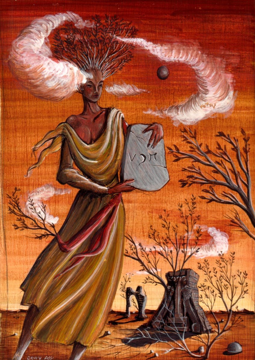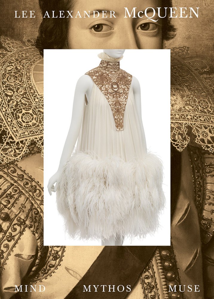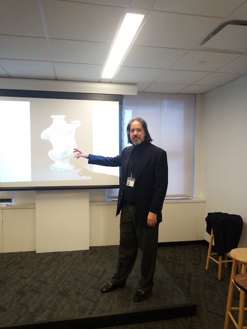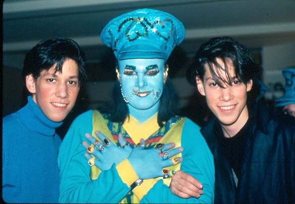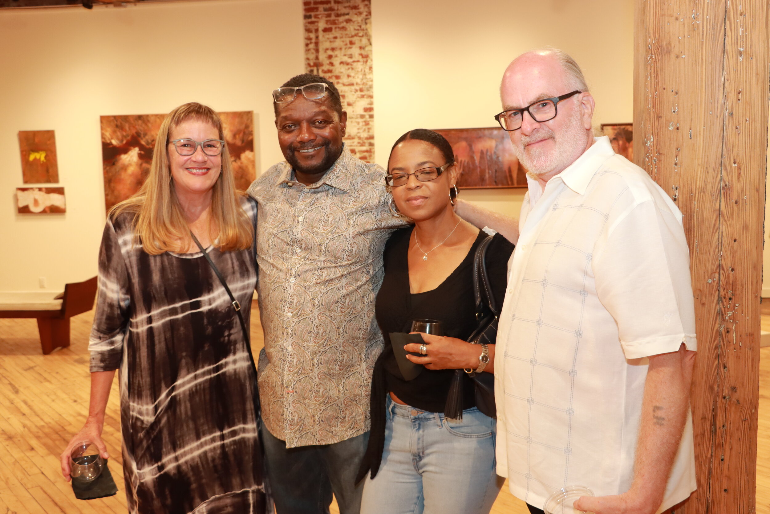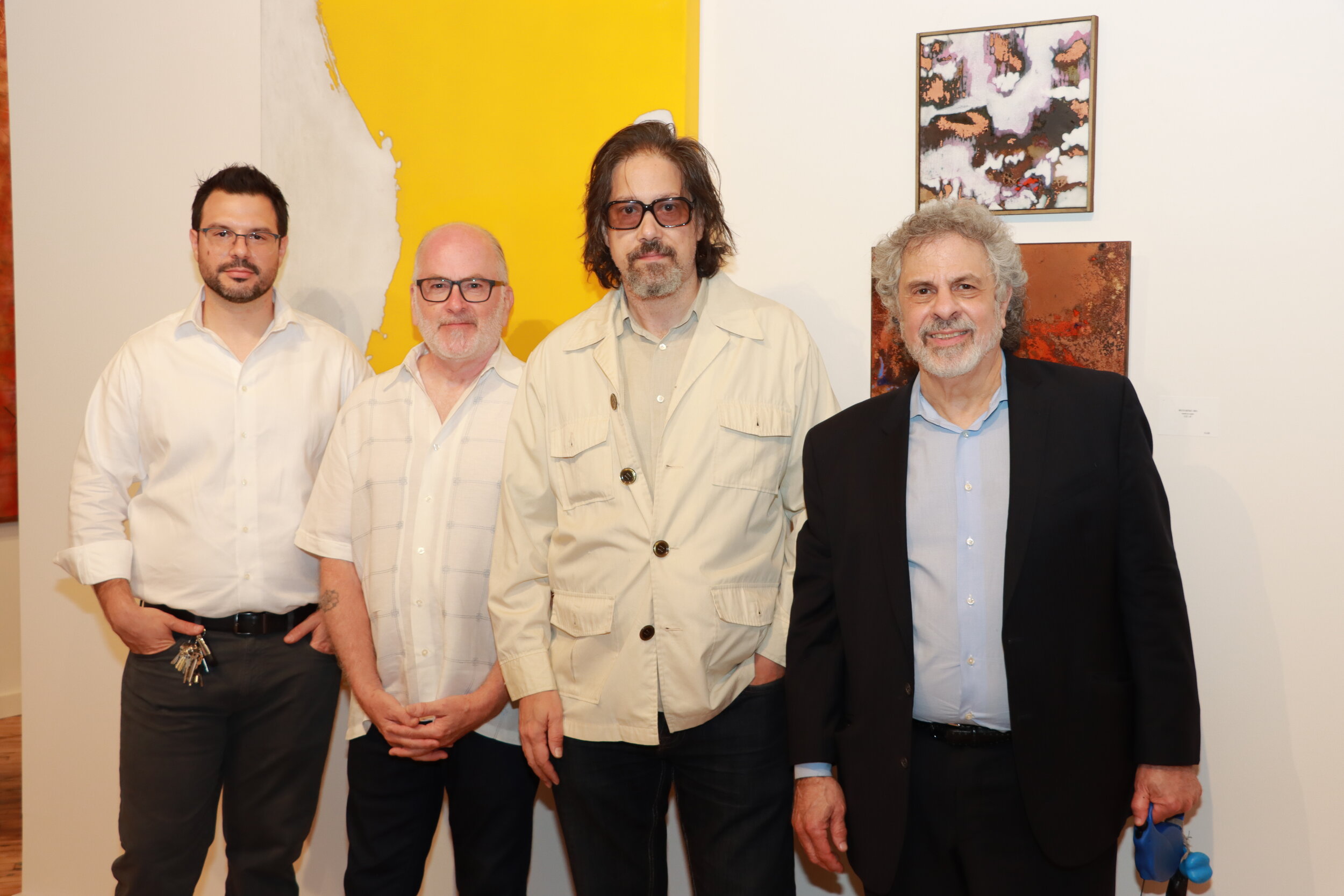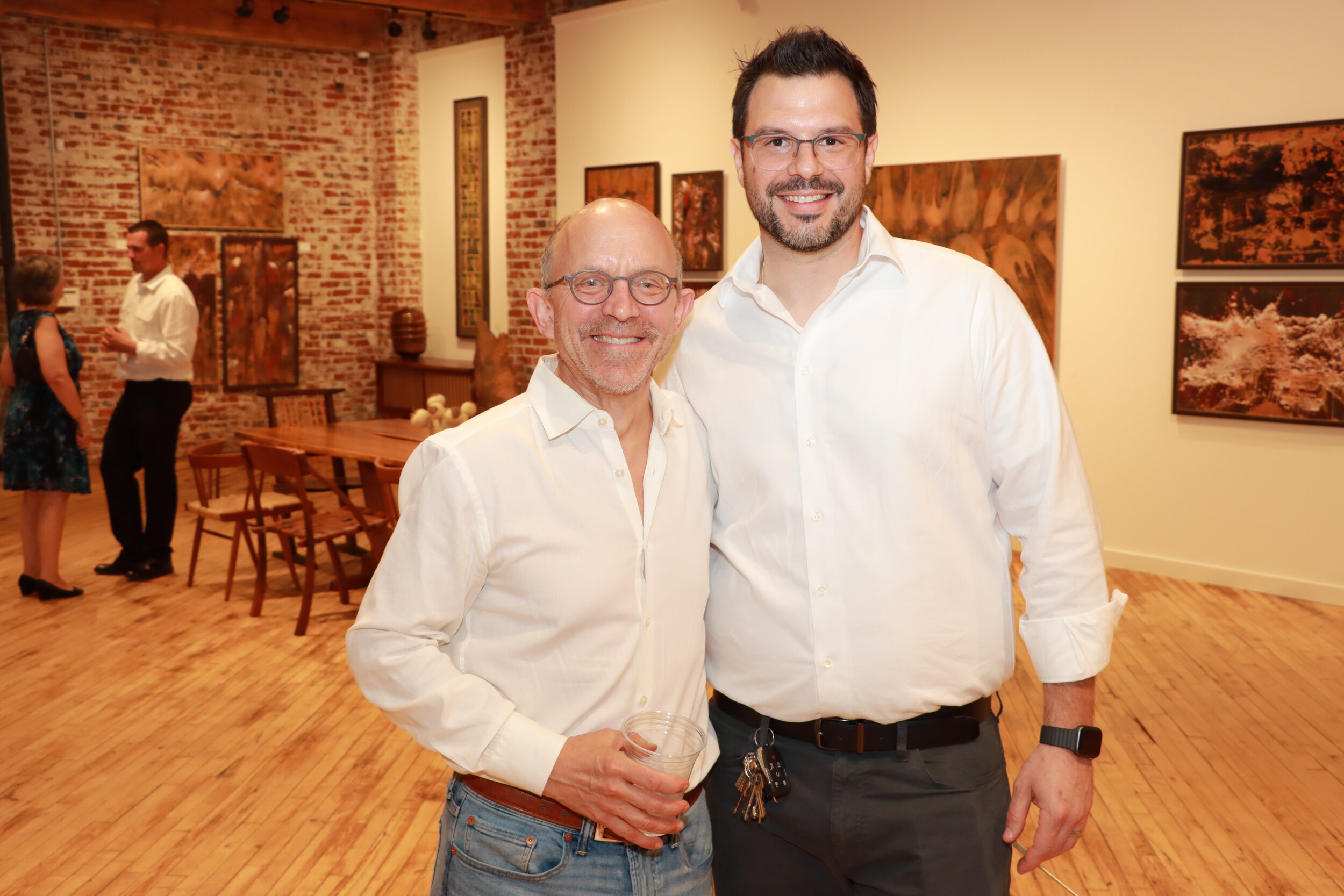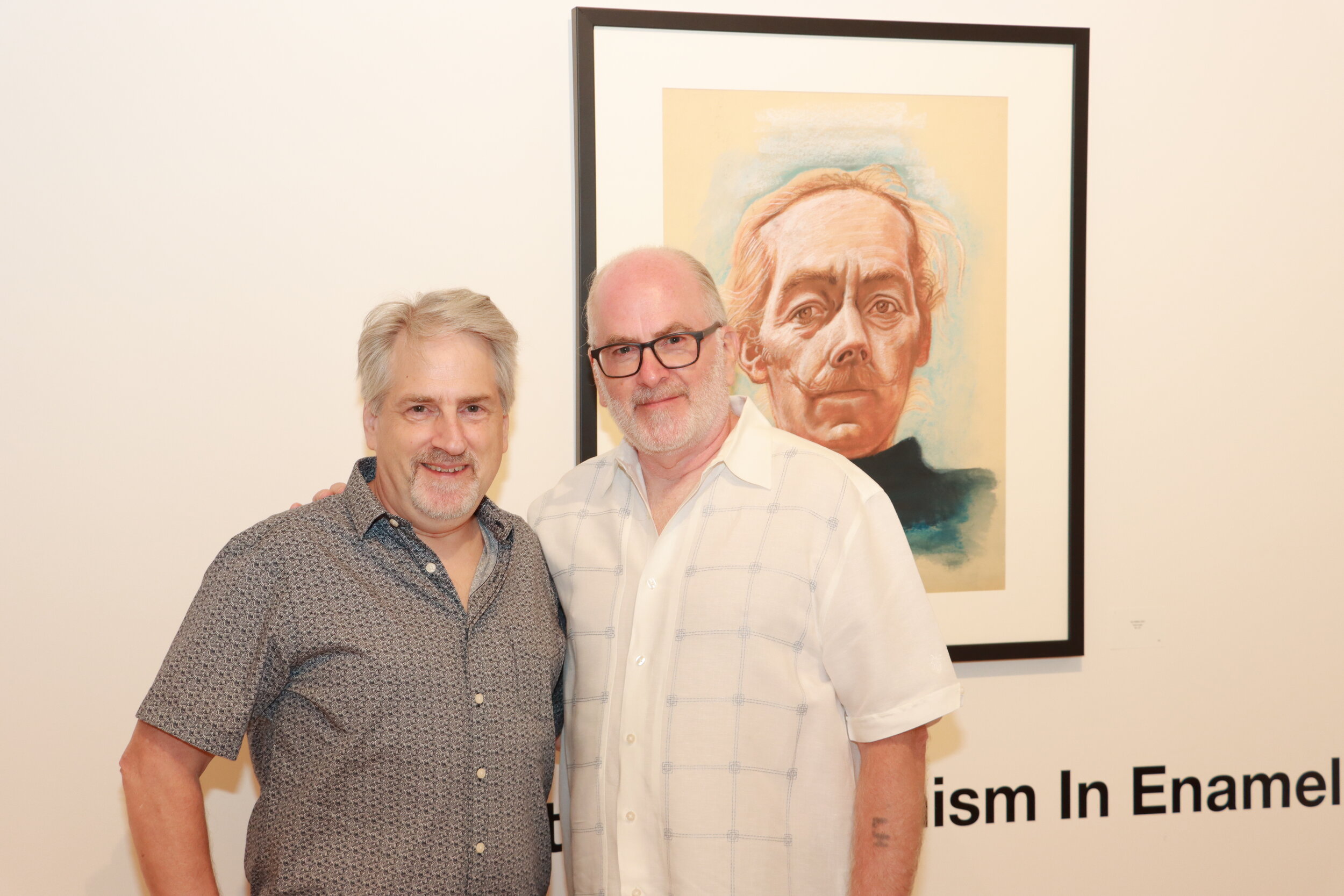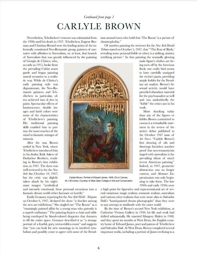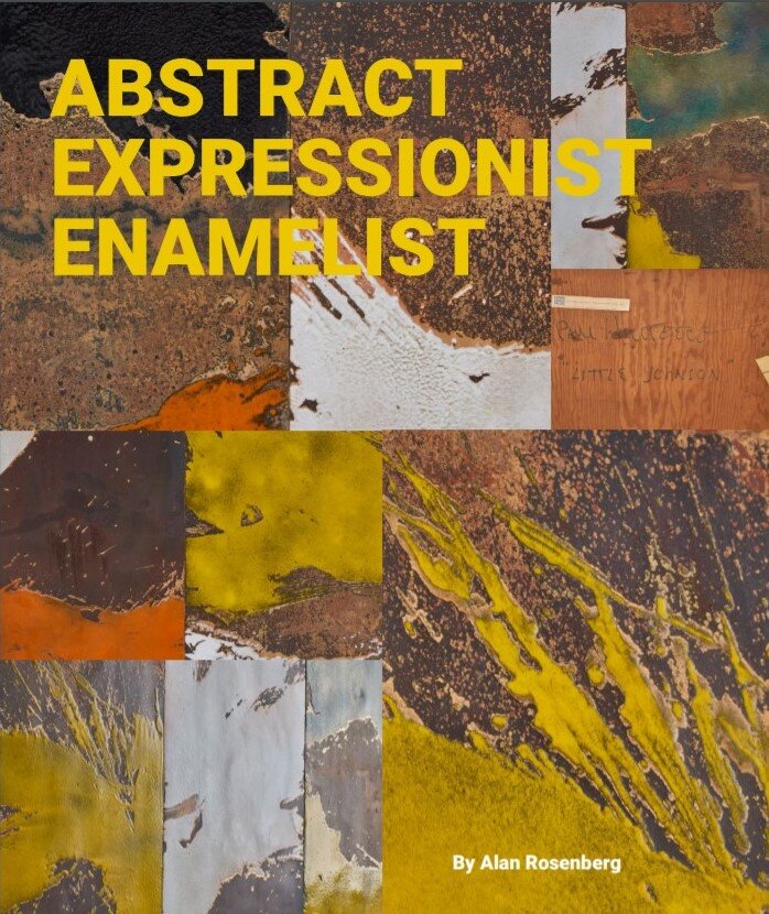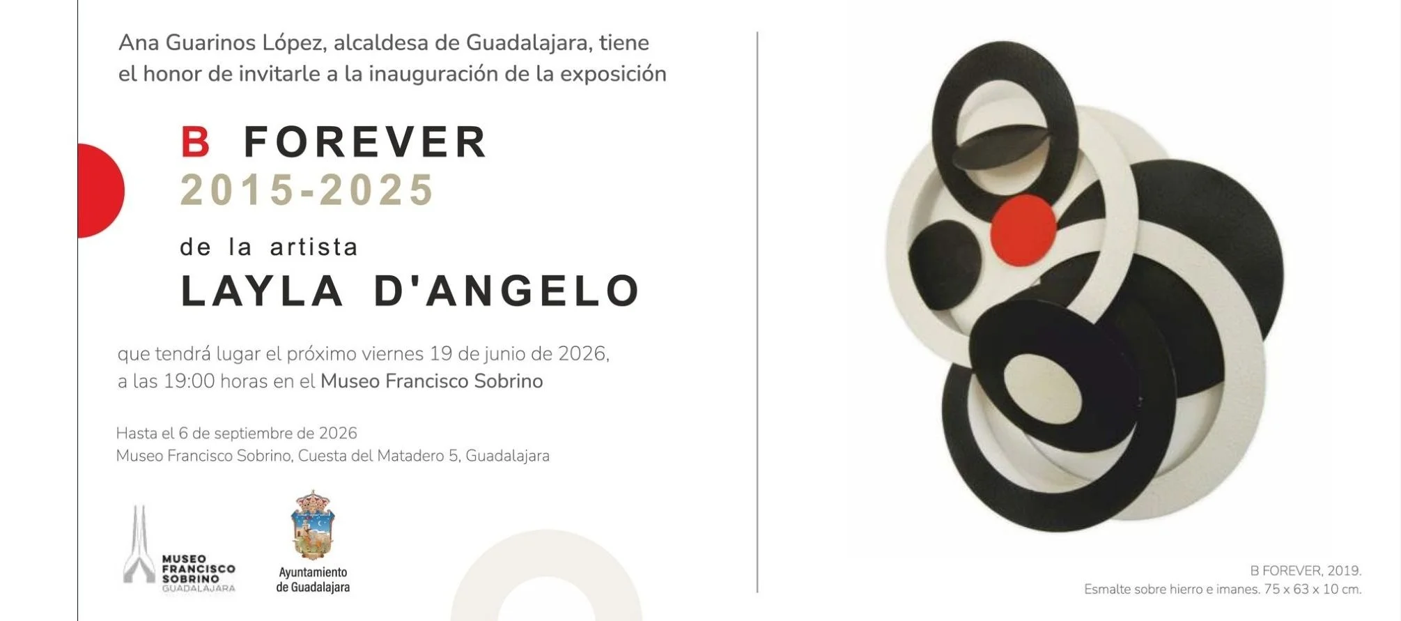


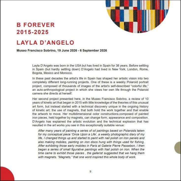


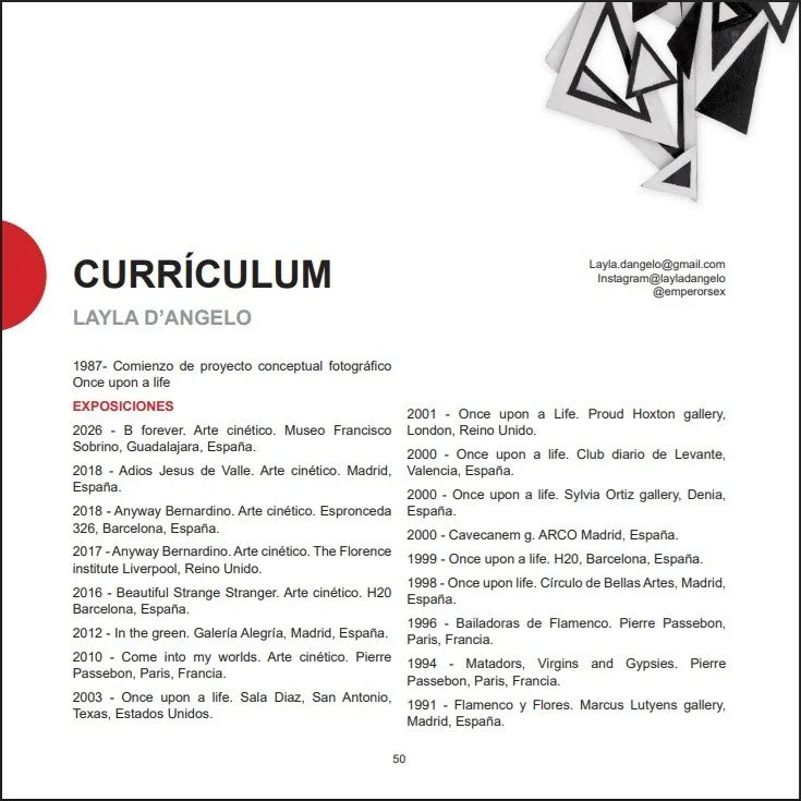
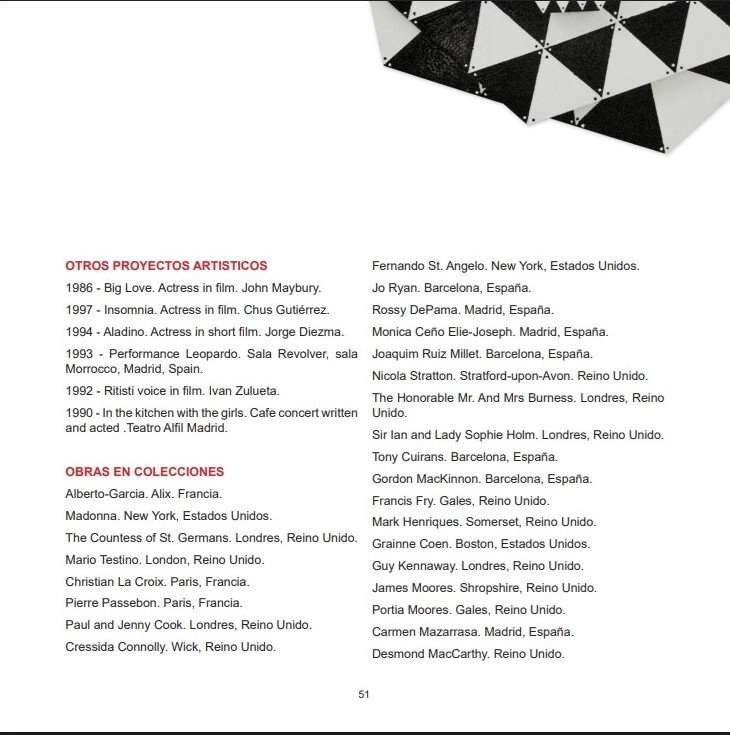

I am very pleased to let you know that I have written the text for the catalogue accompanying Layla D’Angelo’s retrospective of a decade of her kinetic sculpture at the Museo Francisco Sobrino in Guadalajara, Spain, on view from June 19th to September 6th 2026. An excerpt of the catalogue is shown in the images above and the full text is reproduced below. Please contact me if you would like to receive a PDF of the entire catalogue, in which the text is published in English and Spanish. The Museo Francisco Sobrino is dedicated to the work of Spain’s foremost artist who worked in the realm of optical and kinetic art, and the work of contemporary artists carrying on those movements.
******************************
Layla D’Angelo was born in the USA but has lived in Spain for 38 years. Before settling in Spain (but hardly settling down) D’Angelo had lived in New York, London, Rome, Bogota,and Mexico
In these past decades the artist’s life in Spain has shaped her artistic vision into two completely different long-running projects. One of these is a weekly Polaroid portrait project, composed of thousands of images of the artist’s self-described “colorful life,” an auto-anthropological project in which she views her own life through the Polaroid camera she directs at herself.
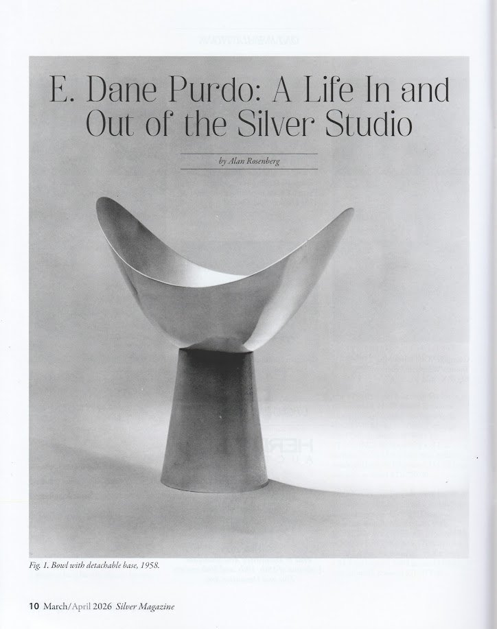
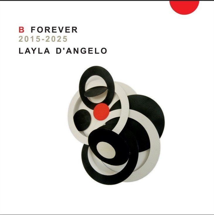
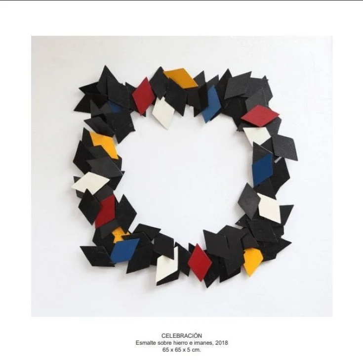
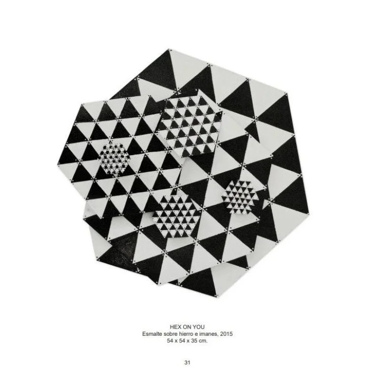
Her second project presented here, in the Museo Francisco Sobrino, is a review of 10 years of kinetic art that began in 2015 with little knowledge of the theories of this unusual art form, but instead started with a technical discovery unique in the ongoing history of kinetic art: the use of magnets, that both hold the work together and that enable the artwork to move. Her multidimensional color constructions,composed of painted iron pieces, held together by magnets, can change form, appearance and composition. D’Angelo has explained the artistic evolution and the technical explosion that has resulted in the art works you see in this exceptionally suitable venue:
After many years of painting a series of oil paintings based on Polaroids taken for my conceptual piece ‘Once Upon a Life’, a weekly photographic diary of my life, I changed things up and started to paint with nail polish on iron panels and also making mobiles, painting on iron discs hung with things used for fishing. After exhibiting those early mobiles in Paris at Galerie Pierre Passebon, I then began a series of small figurative paintings with Nail polish on iron. When the time came to exhibit those pieces , the gallerist suggested that we hang them with magnets. “Magnets,” that one word inspired this whole body of work.
FROM BEAUTIFUL STRANGE STRANGER TO ANYWAY BERNARDINO TO B FOREVER
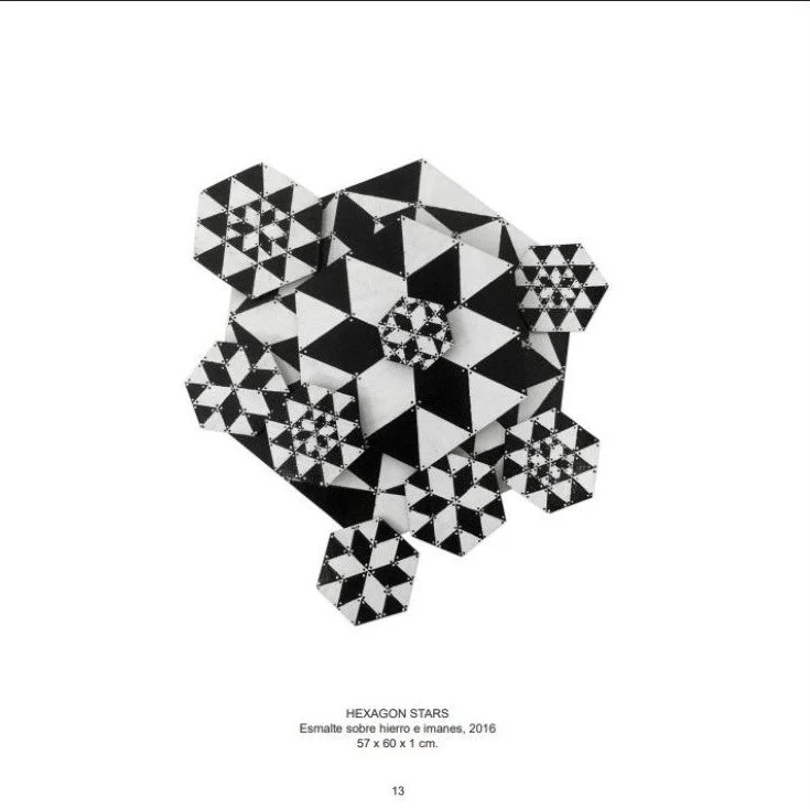
Layla D’Angelo’s art offers an invitation to the infinite. Hints of Russian constructivism, op art and kinetic sculpture are combined in black, white, yellow, red and blue wall mounted iron constructions, held together with magnets, that can be subjected to unlimited reconstruction by the viewer. Fragmentary flat iron pieces suggest diamonds, lozenges, fishscales or jigsaw puzzle pieces, the composite form of which is never final, never reaching conclusion. The black -and-white image of the chess or checkers board is present in works that are an invitation to play: move the game pieces and plot your next move.
A closer look at the surface of the artist’s earlier iron pieces, exhibited in 2016 in Barcelona at Galerie H2O in an exhibition poetically titled “Beautiful Strange Stranger,” reveals painstakingly applied minute dots of color which upon close inspection are discovered to be nail polish. The sculptures have the appearance of pure abstractions but the artist’s use of nail polish as paint give them a literal coating of post-feminist critique. Their resemblance to exploded patchwork quilts and use of a raw material of feminine allure suggest a subtle and simultaneous critique and celebration of women’s work and beauty culture. D’Angelo’s play on femininitude is seen in works that appear as concentric circles, evoking the mystique of the female physical void and the feminine psychic vortex. The constructions’ fragmentation and mutability stand in opposition to the classical monolith, associated art historically with the male presence.
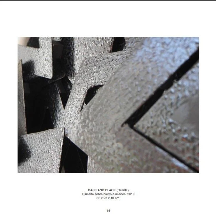
In D’Angelo’s recent work she has altered her technique and her palette, reflecting her personal desire to explore new, but still unconventional ways to apply color, and in response to ecological concerns. The artist explains that “the dots, which are bigger, are applied with a syringe. The new pieces are less toxic as I use an ecological water based acrylic paint; totally different from the super-toxic nail polish.” The black and white of the earlier work, hinting at signs of hazard, has been gradually supplanted by the primary colors of red, yellow and blue, a simple experience of aesthetic pleasure and the added bonus of being non-toxic, for artist and audience.
D’Angelo’s corner mounted works echo the Russian constructivists’ engagement of this previously overlooked placement: Vladimir Tatlin’s 1914 “Corner Counter-Relief” and the 1915 Petrograd exhibition of Suprematist paintings by Kazimir Malevich, in which his black and white geometric canvases took on three-dimensional form through oblique mounting at the meeting of walls and ceiling. Echoes of mid-20th century Latin-American neo-constructivism are present as well: the astute observer will notice a nod to Lygia Clark’s relational objects and flexible sculptures of the 1950s and 60s. The artist credits an admiration for Mondrian in the emphasis on the red, yellow and blue in her recent work. Even the most uninformed art viewer will recognize D’Angelo’s quotation of ultimate Op artist Bridget Riley’s stripes and spirals. Historical antecedents are apparent, but D’Angelo is not a theorist or an academic. A life devoted to creativity, beauty and pleasure has brought her art to the place it occupies today. When asked the meaning of the seemingly cryptic title of the present exhibition “B Forever” she remarks that “B is for my darling late friend Bernardino. He loved this work.” Bernardino’s affirming presence was recognized in the second exhibition of the artists kinetic art, presented at Barcelona’s Espronceda Institute of Art & Culture, jauntily titled “Anyway Bernardino” and, indeed, the art moved in any way the viewers chose to recompose it, via D’Angelo’s unique use of magnets to make art that is mutable.
Despite the protestations by the artist that there is no “deep” meaning to her work, other than creating art that brings pleasure, her kinetic art is literally a visual puzzle, and it is part of a lineage in art history (a lineage magnificently represented by the Museo Francisco Sobrino itself).
Rosalind Krauss observed that in constructivist theory art was seen as "an investigatory tool in the service of knowledge." What knowledge is D’Angelo seeking to convey? Is there even any objective truth to convey? The title of one piece, “Chequered Life,” and its changeable form suggest that there is no objective truth but instead there is only subjective experience: life is open ended and art is what you make of it, literally. In this sense D’Angelo’s constructions are Dionysean rather than Appolonian. They are on the side of subjective play, chance and the irrational rather than objective truth and enlightenment. They are subjects not objects: they are constantly subject to the absolute control of the viewer.
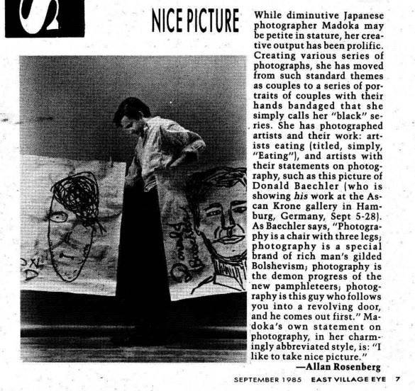
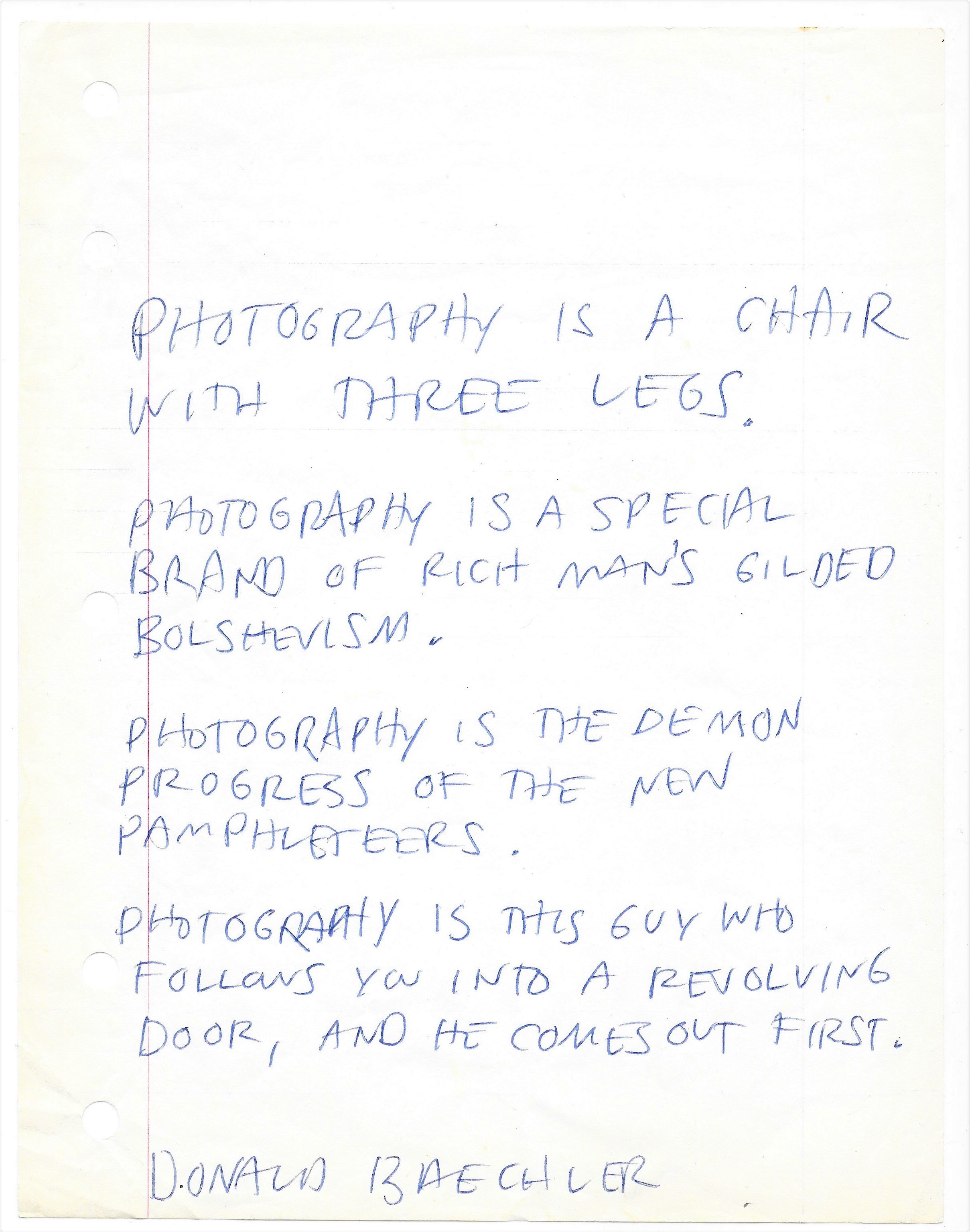
©Alan Rosenberg