EXHIBITIONS CURATED BY OR ACCOMPANIED BY ESSAYS BY ALAN ROSENBERG

REDISCOVERING PAUL HULTBERG (1926-2019): ABSTRACT EXPRESSIONISM IN ENAMEL, at Moderne Gallery, Philadelphia, June - September 2021

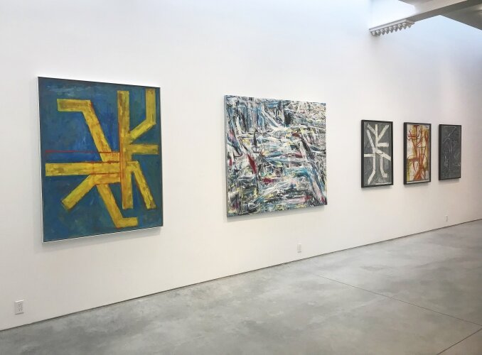
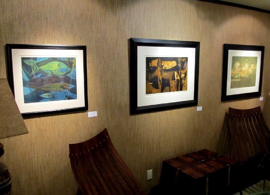
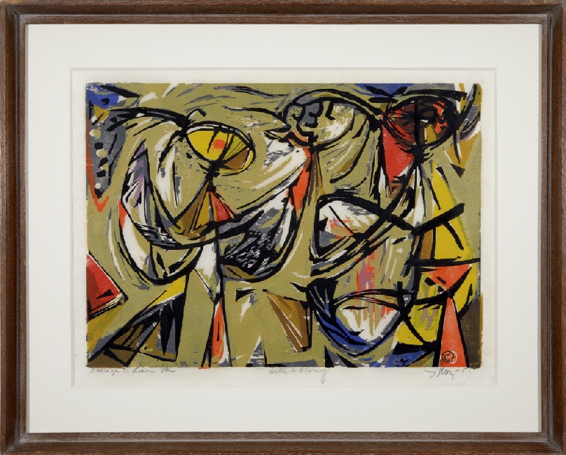
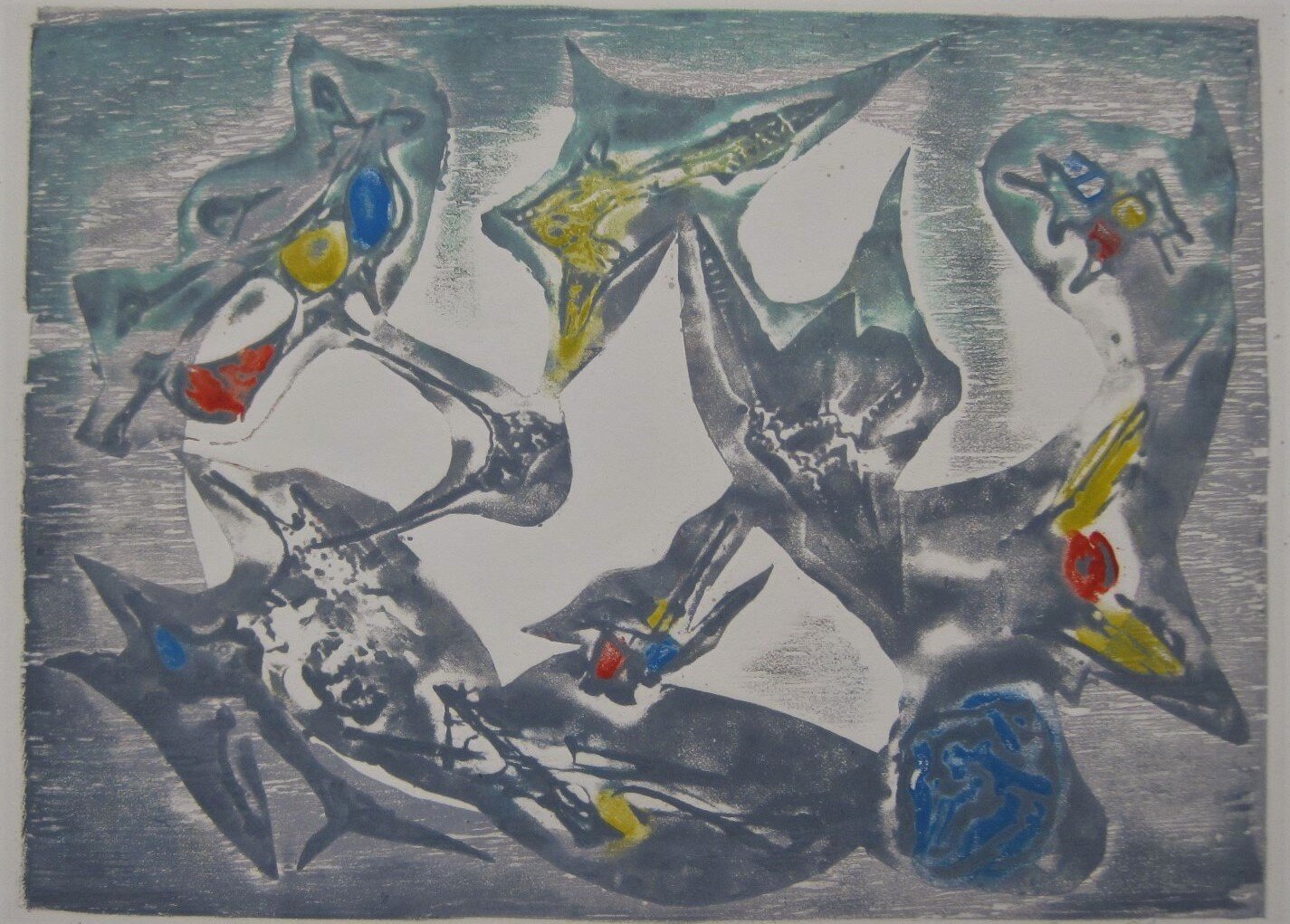
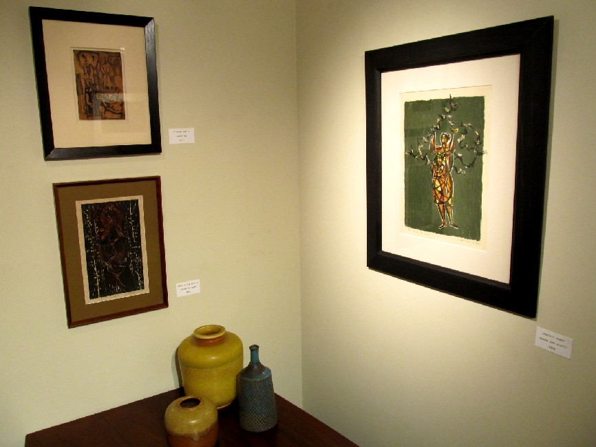
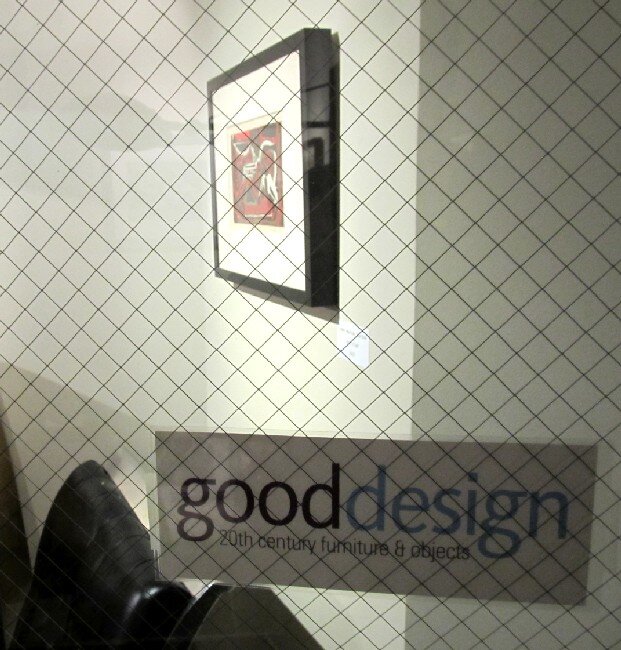
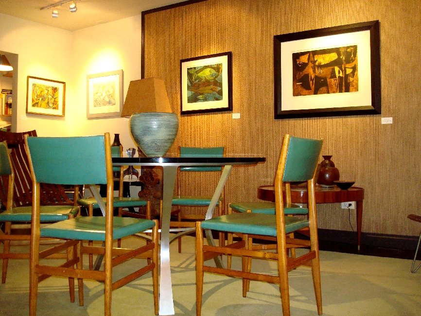
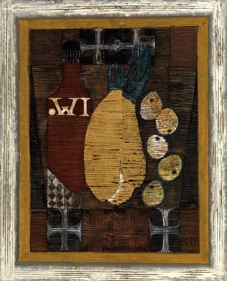
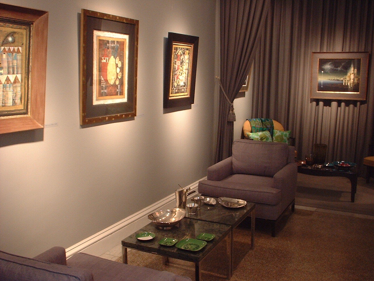
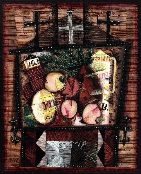
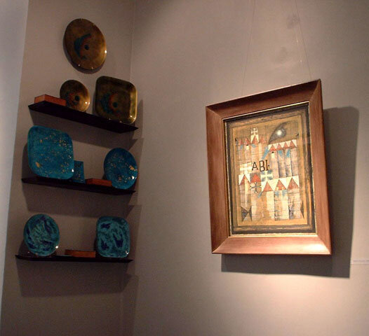
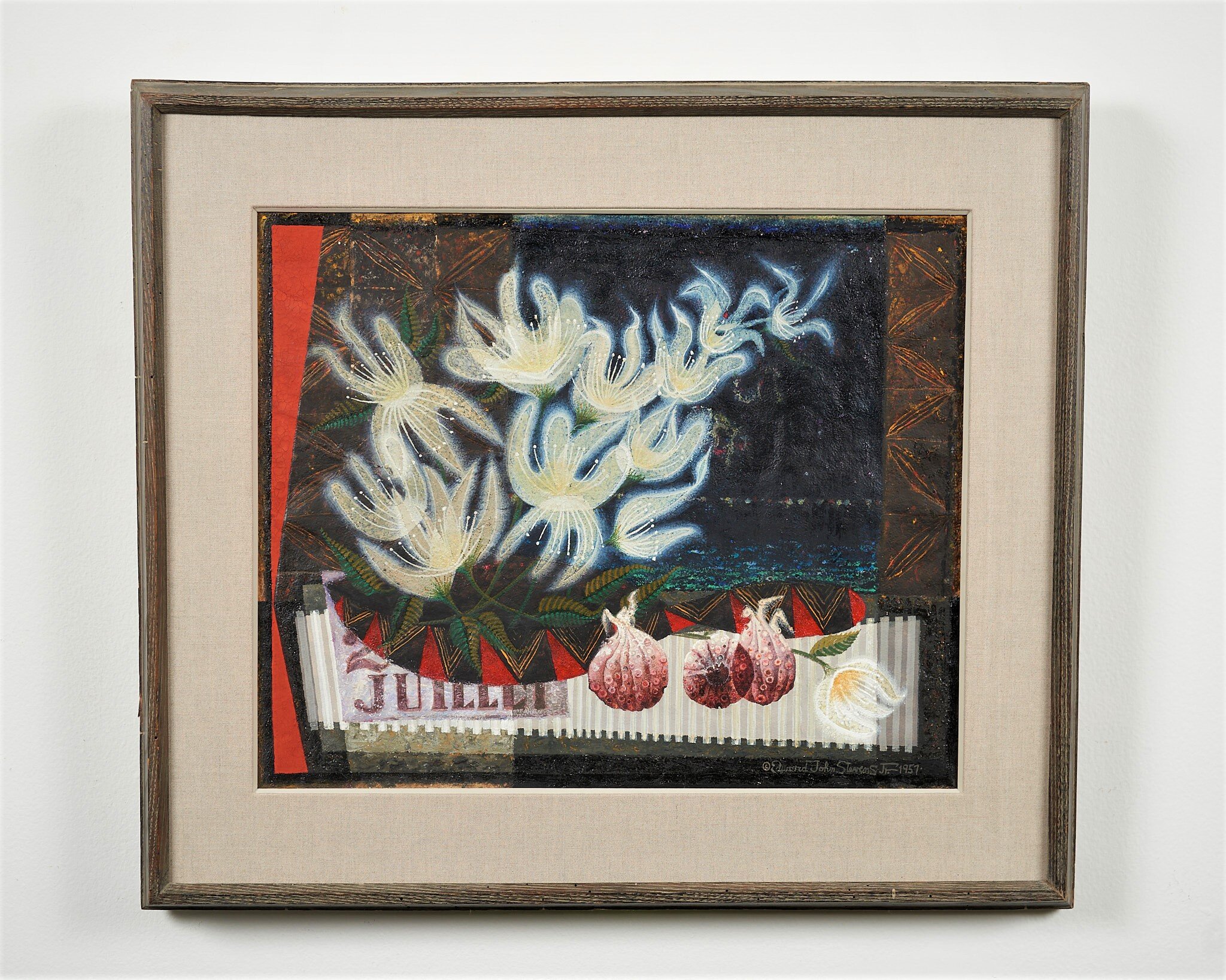
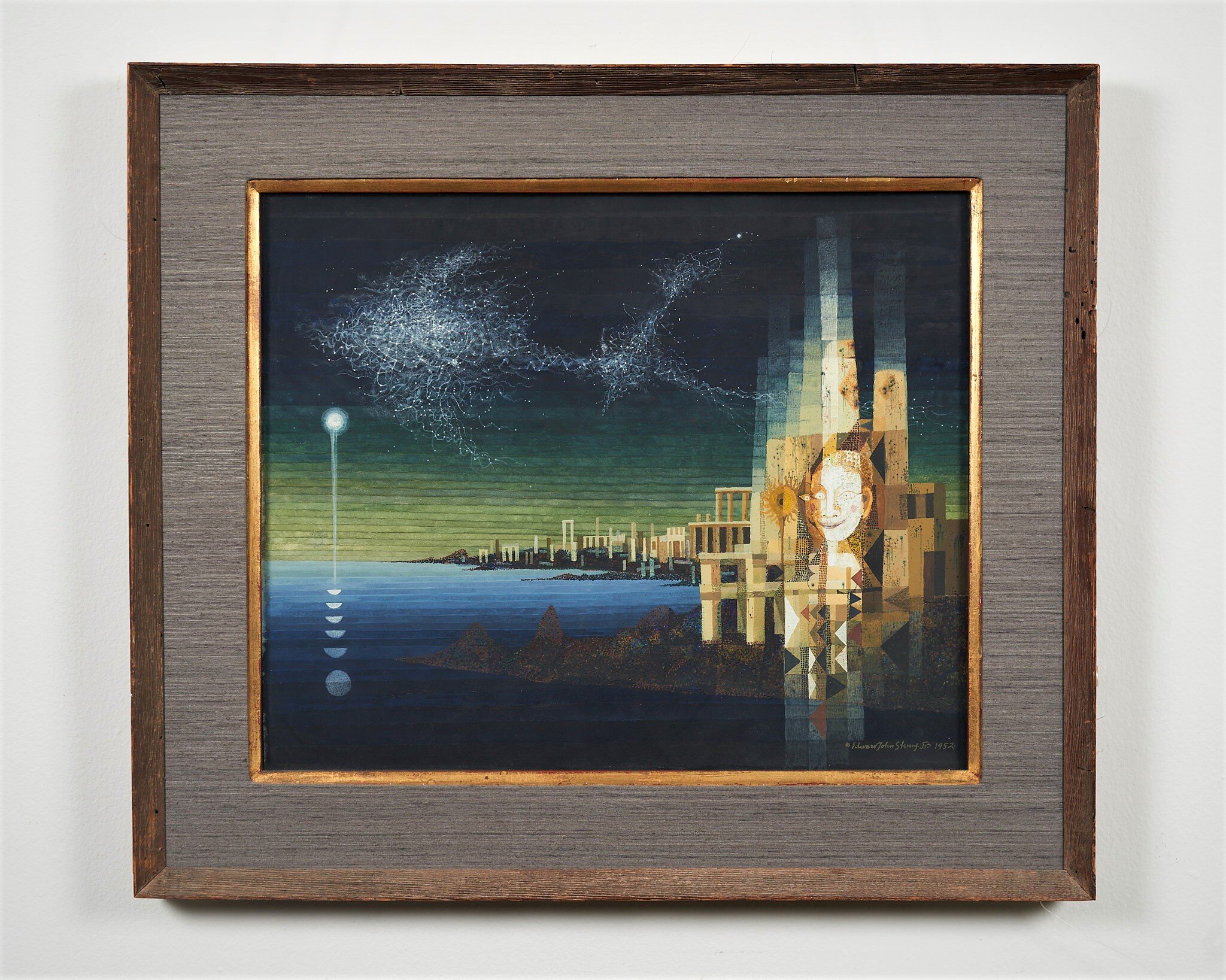
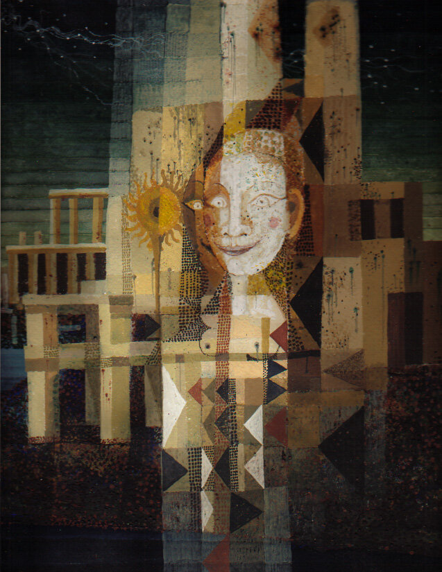
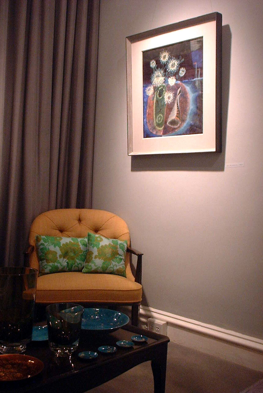
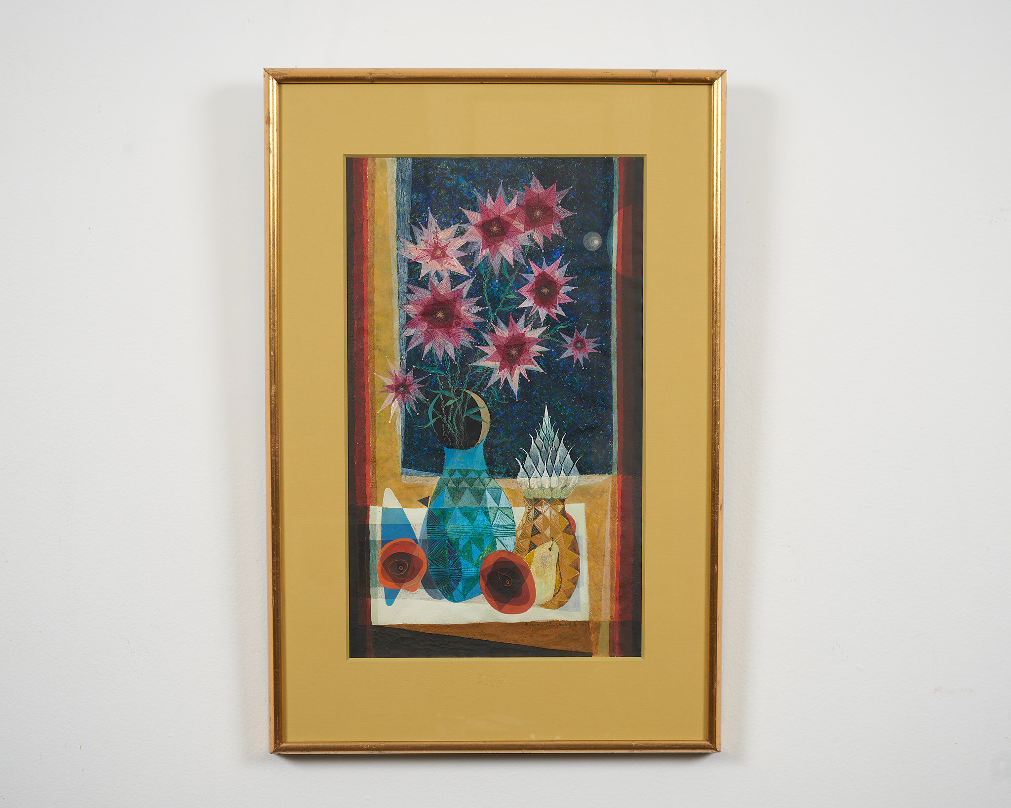
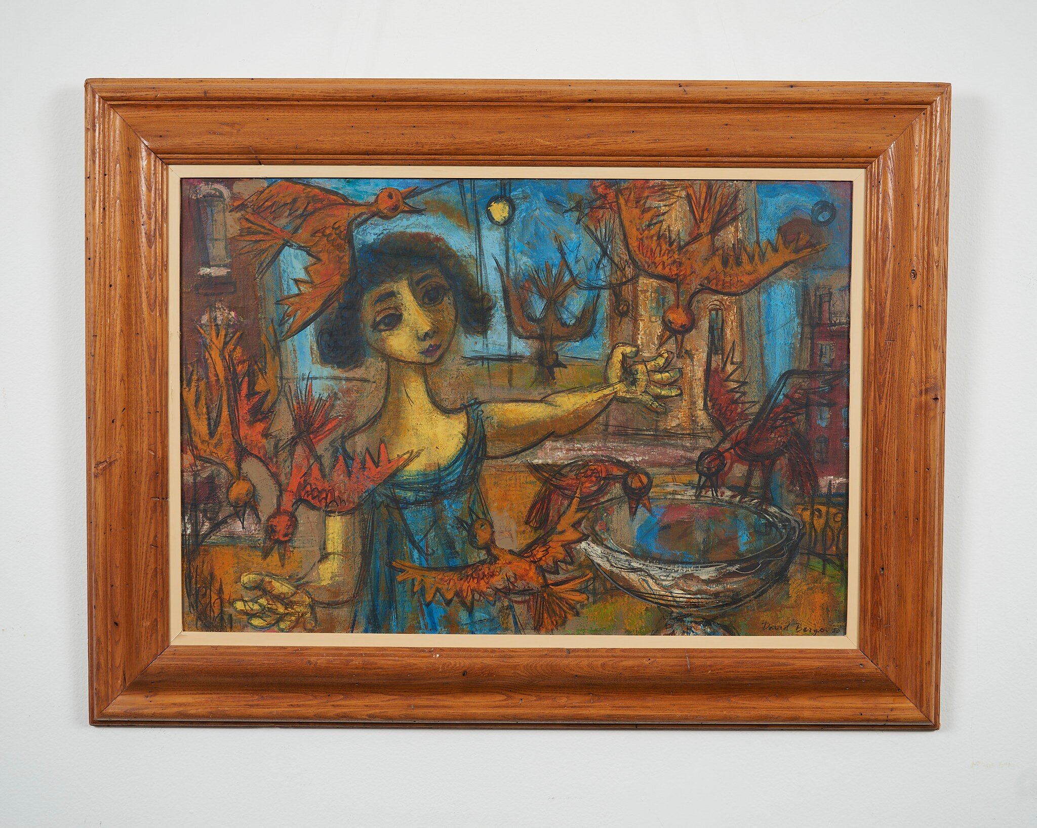
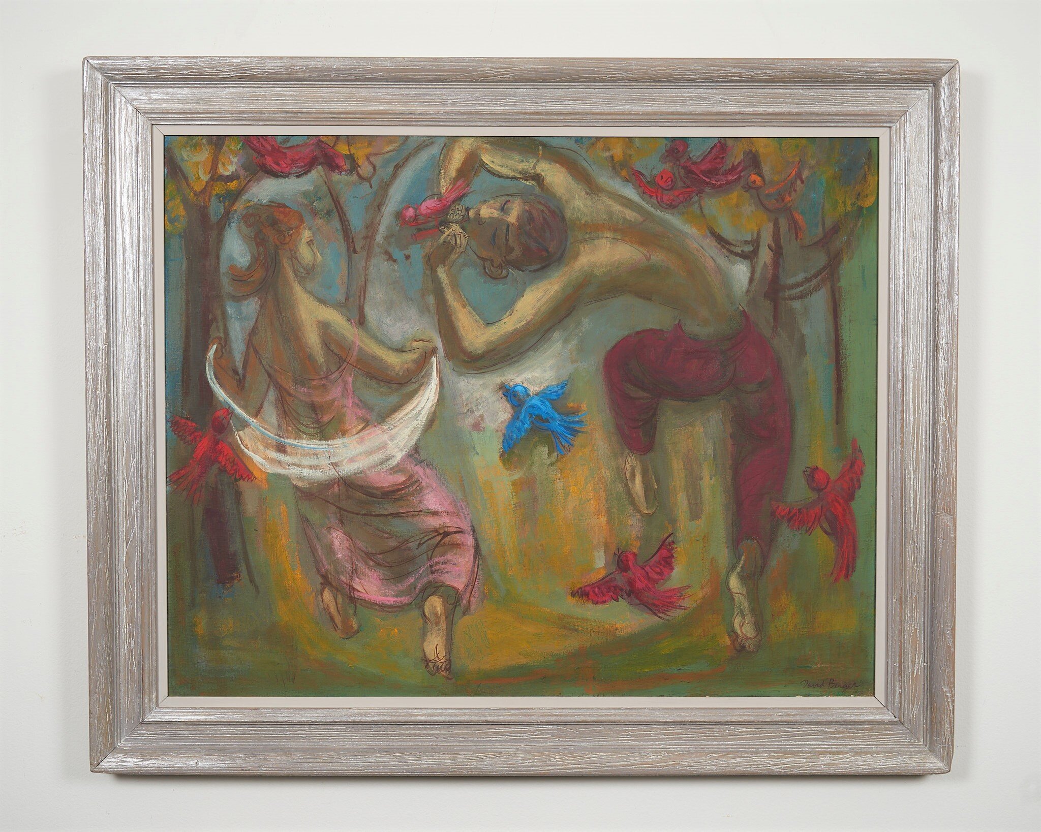
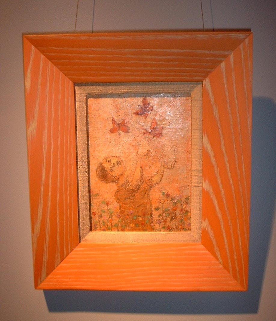
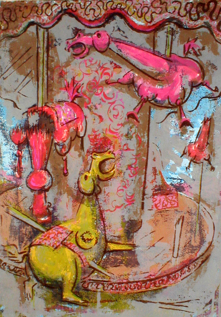
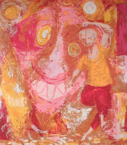
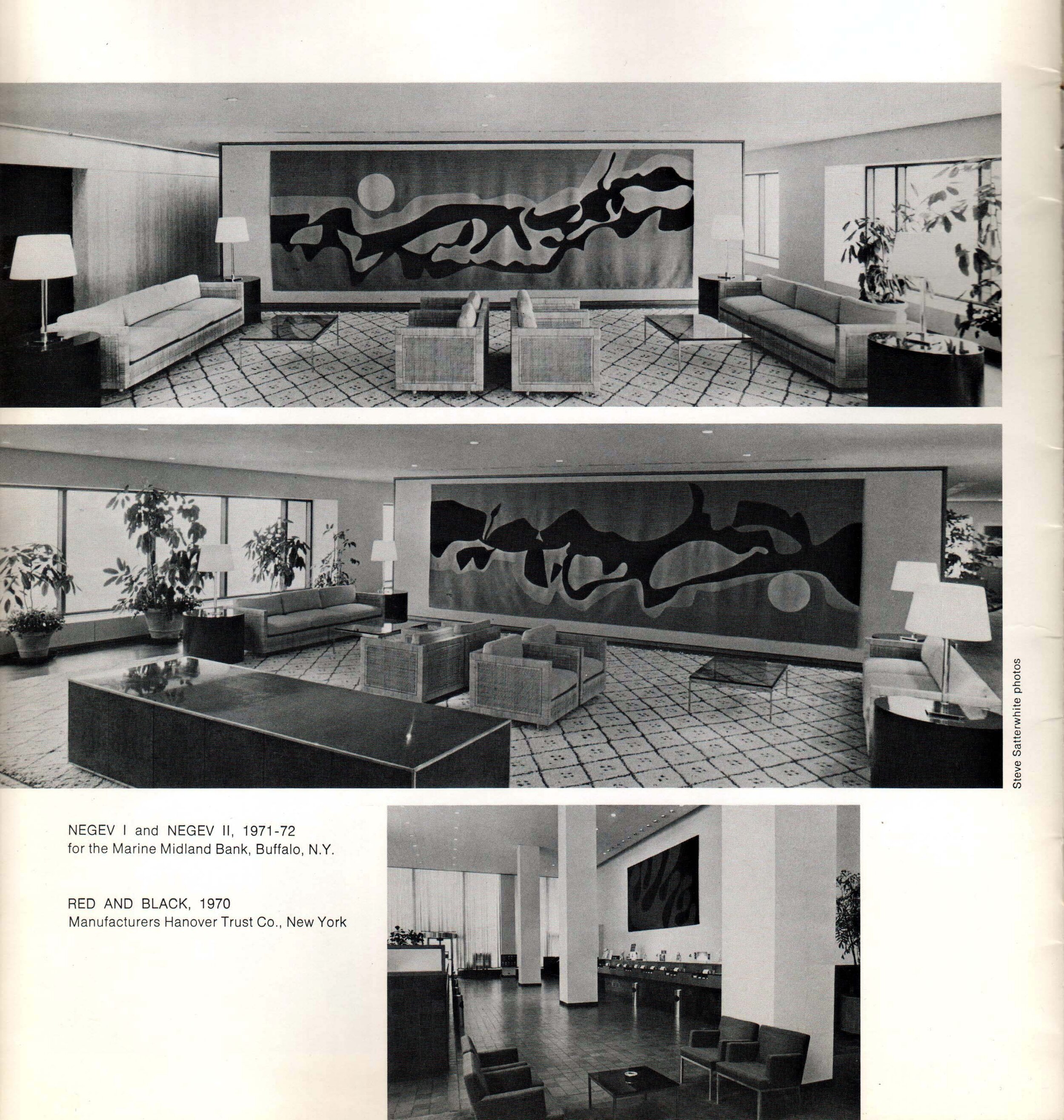
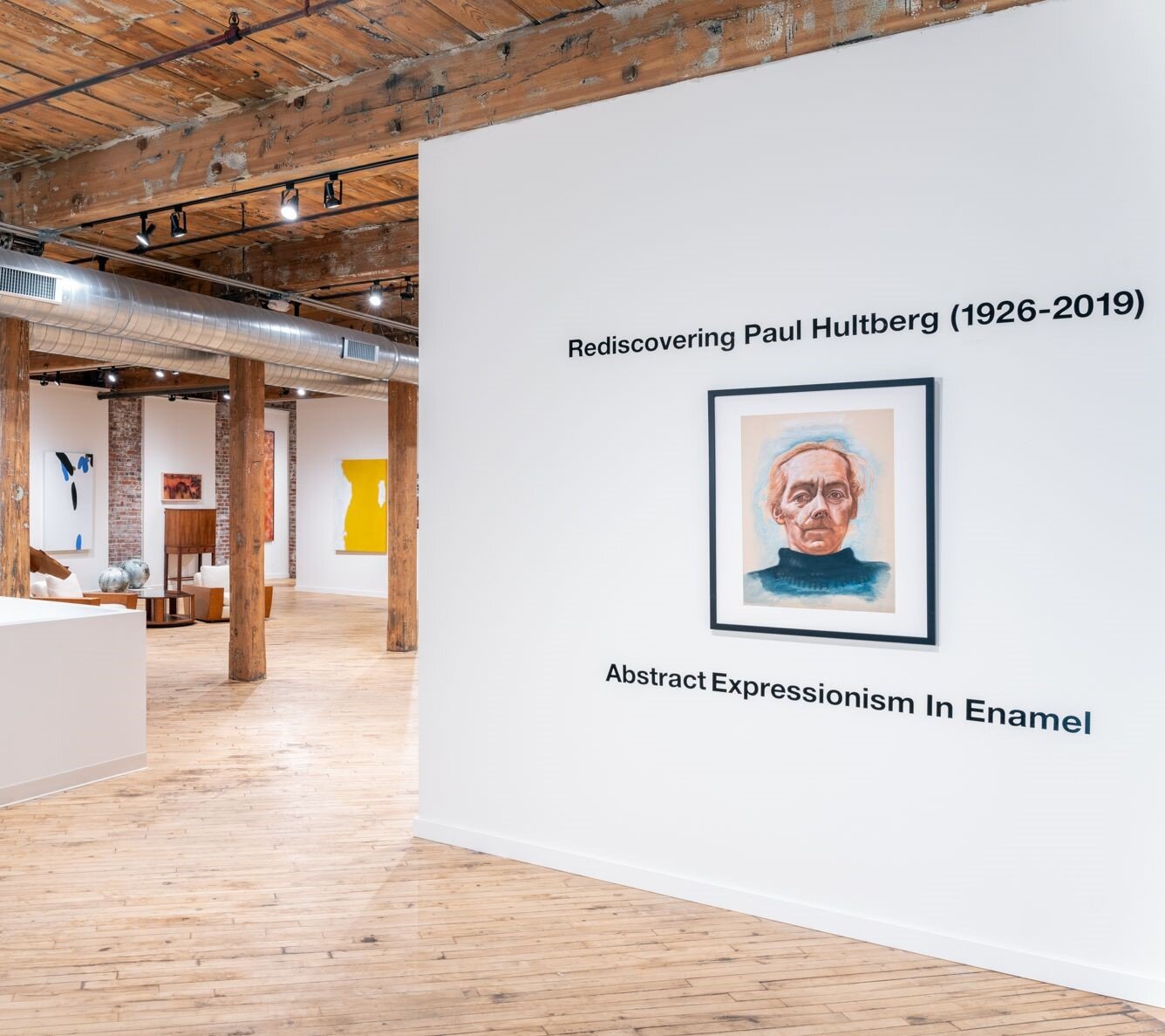
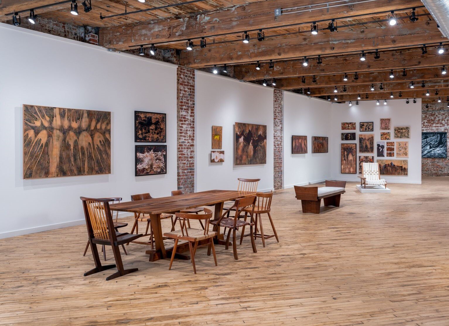
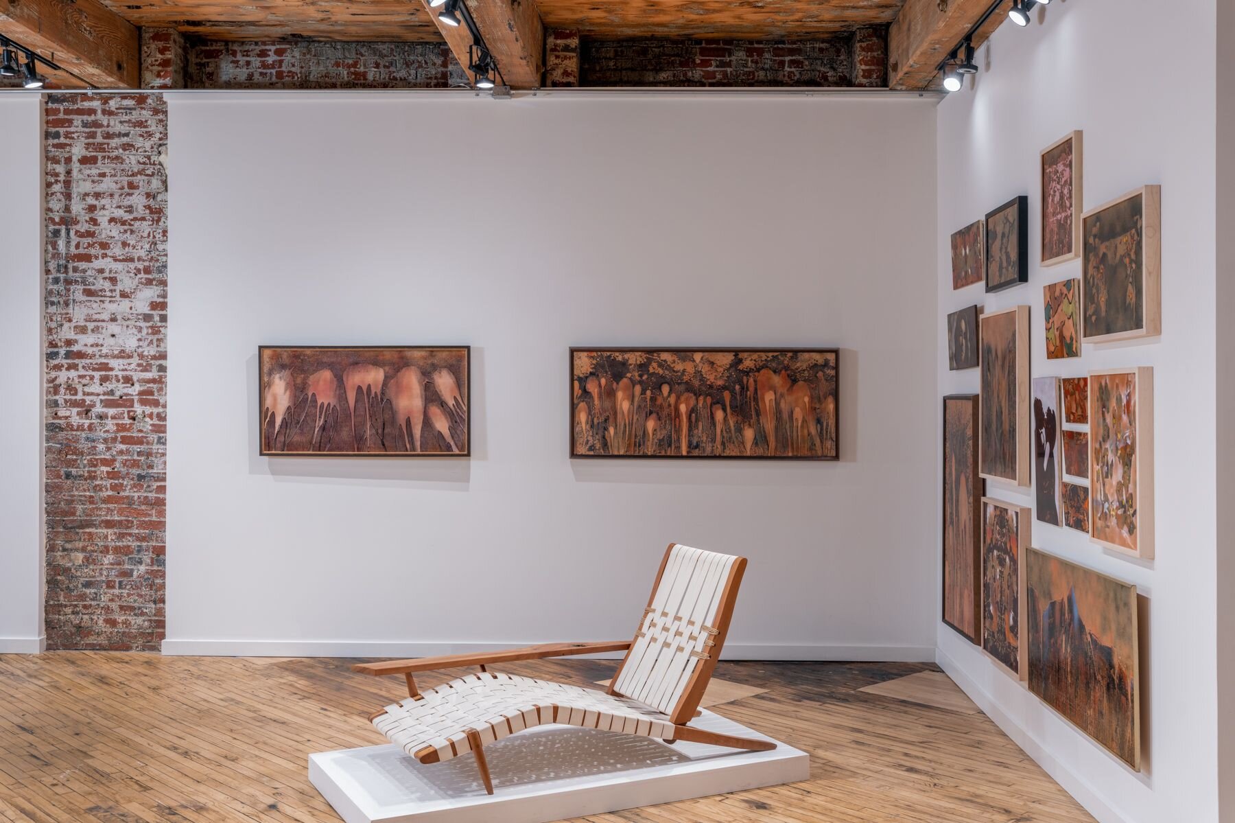
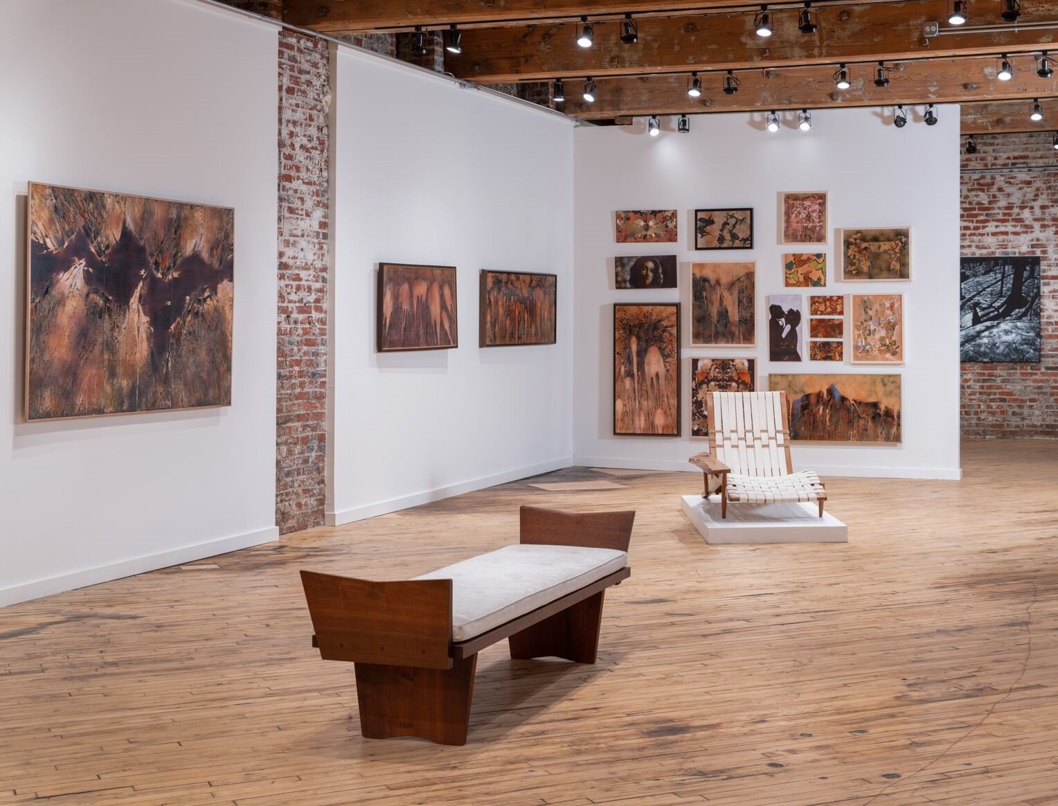
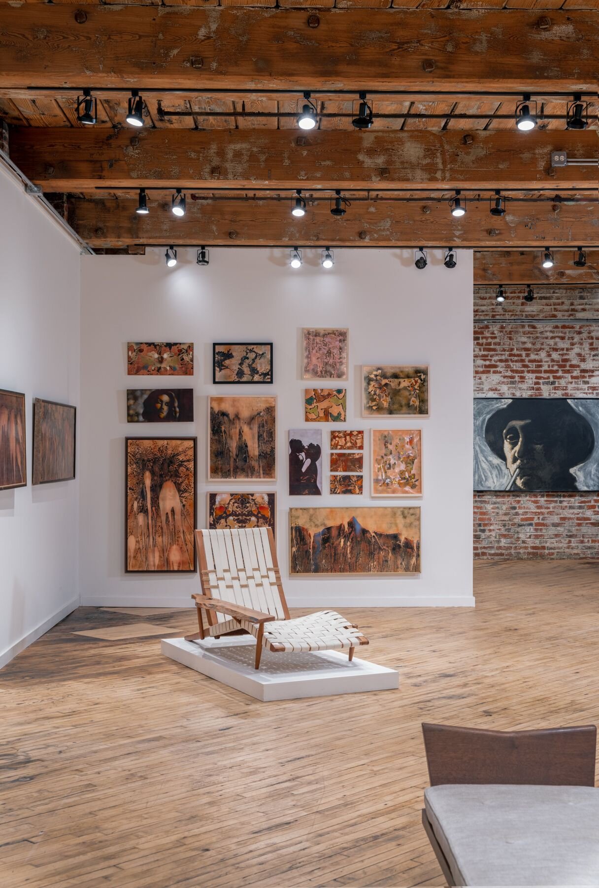
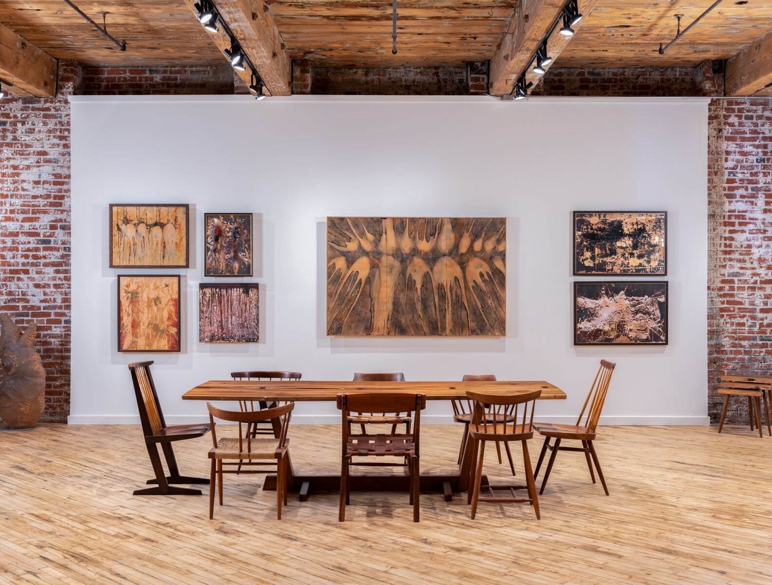
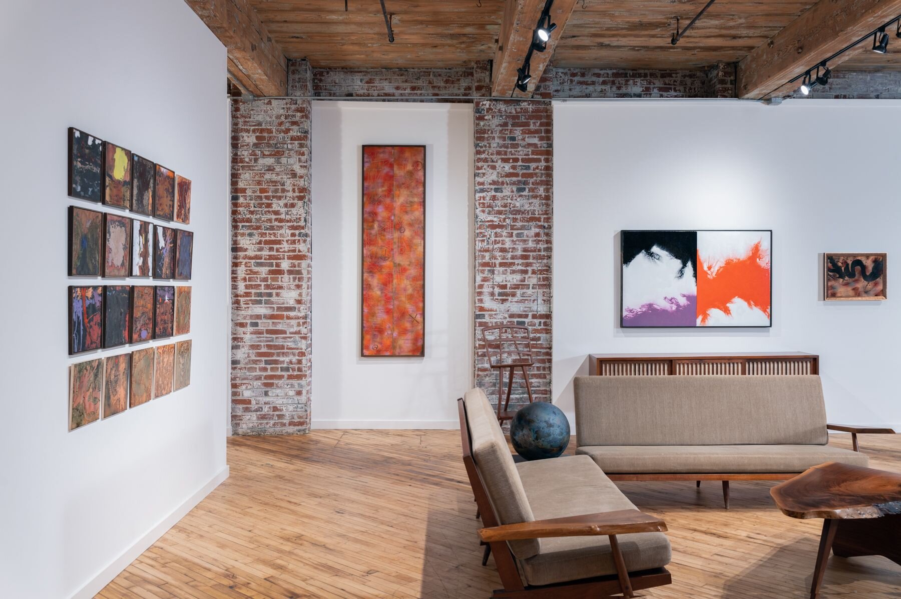
Philadelphia’s Moderne Gallery is presenting an exhibition from June to September 2021 that examines the unique artistic legacy of Paul Hultberg, the first large-scale exhibition of work by this multi-disciplinary artist since his death at 93 in 2019. A once celebrated contributor to the Studio Craft movement, in recent years Hultberg has been attracting renewed recognition as one of the most progressive artists working in enamel on metal in the mid-twentieth century. While he originally trained as a painter, Hultberg began experimenting with enamels in the 1950s, eventually developing his own abstract style that paralleled what many of his peers were doing with paint and canvas in this period. Over the following decades, Hultberg mastered and then revolutionised enameling techniques and became renowned for his large-scale architectural and public works. Rediscovering Paul Hultberg (1926-2019): Abstract Expressionism in Enamel shows both the artist’s early work in vitreous enamel on copper as well as later works in porcelain enamel on steel; a 3D virtual walk-through of the exhibition is available at the Moderne Gallery’s website: https://www.modernegallery.com/ . The gallery has published an in-depth catalogue of the works shown which includes essays about Hultberg’s life and works from design scholar Alan Rosenberg and curator and writer Glenn Adamason. In his essay Alan Rosenberg writes that

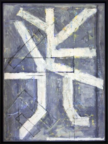
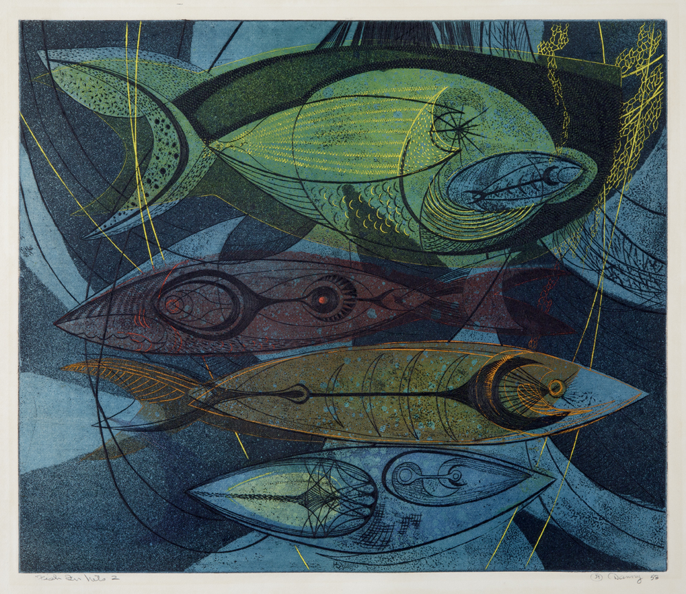
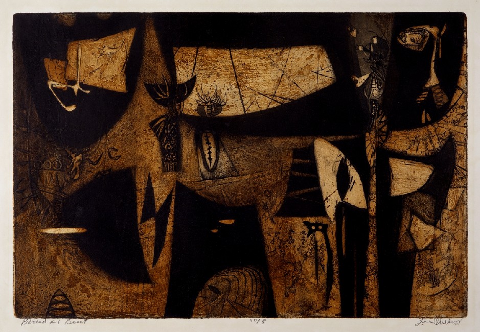
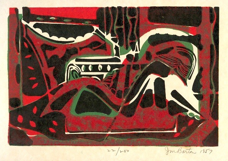
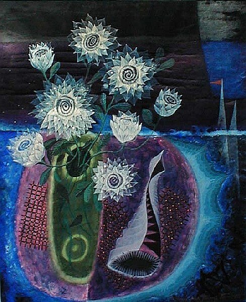
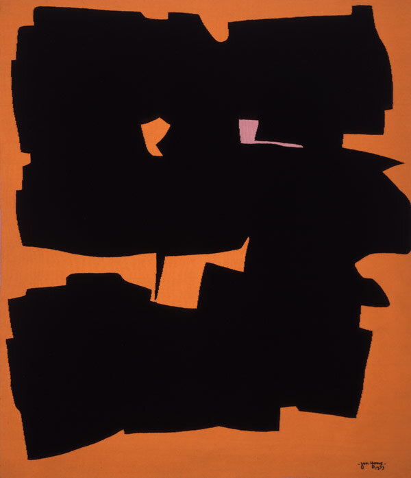
Enamel has been known since antiquity and its appeal, then and now, lay in its rich visual and tactile qualities: its jewel-like colors and glossy-smooth surface. Paul Hultberg (1926-2019) took this traditional craft medium and spread enamel broadly and even brashly over wide fields of copper and steel, just as his abstract expressionist peers did in paint on canvas. Where once it was delicate, Hultberg made enamel bold. Enamel had traditionally reflected light in its mirror-like surface: Hultberg played smooth against rough surfaces in planes that glisten with explosive color, but also absorb and exude darkness like a celestial black hole.

Rosenberg concludes by observing that “Paul Hultberg lives forever in his art, and enamel is much like life: paradoxically fragile and easily broken if mishandled but durable and very long-lasting when treated well.”

View the entire catalogue on Issuu.

FRITZ BULTMAN / REGINA SCULLY: NEW ORLEANS, NEW YORK AND BEYOND, OCTOBER 2019, Octavia Art Gallery, essay by Alan Rosenberg

Octavia Art Gallery, one of New Orleans’ most respected contemporary art venues, took up temporary residence in New York in October 2019 with a visually stunning pairing of artists Fritz Bultman and Regina Scully. Bultman is recognized as the most important mid 20th century abstract expressionist to come from New Orleans; Scully is the most notable abstract painter to emerge from New Orleans in recent years. The exhibition was on view at High Line Nine, the exquisitely designed assembly of art viewing spaces directly under the High Line park. A 360° view of the show is available at the Octavia Art Gallery website.

Both artists’ works are bold in spectrum and structure and both could even be described as high-risk painters, pushing themselves and their canvases in experimental directions, resulting in paintings that are fantastically beautiful while strictly avoiding mere prettiness of color and design. 

Overlapping external and internal influences have played a part in both artists’ development. Fritz Bultman (1919-1985) grew up in an outstandingly sophisticated and eccentric family in a grand 19th century house that adjoined the Bultman family’s funeral business and was graced by a fantastic glassed-in wintergarden. A similar Southern Gothic manse played a part in Scully’s upbringing: the turn-of-the-century Greene-Marston house in Mobile, Alabama, affectionately if ominously known as Termite Hall, which remains in the family. The physical and psychological process of painting that Bultman himself described applies strikingly to Scully’s painting journeys as well: “It is the experience of transmutation, of growth and decline, of illumination, that the process of painting contains—only by going through this process, by losing one’s way, by mess, by total chaos, of one’s own making, come unexpected results that one cannot anticipate in any other way.”

Fritz Bultman studied painting with Hans Hoffmann and was described by Robert Motherwell as “one of the most splendid, radiant and inspired painters of my generation.” He maintained close ties to New Orleans but spent most of his adult life immersed in the artistic worlds of New York and Provincetown. Regina Scully received her BFA in Painting from Rhode Island School of Design and her MFA from University of New Orleans. In 2017, Scully had a solo exhibition at the New Orleans Museum of Art which paired her work with examples from the museum’s distinguished collection of Japanese Nanga paintings. She was a recipient of the Louis Comfort Tiffany Foundation Grant Award in 2017.

Many gallery-goers took advantage of the unique opportunity to see the work of Bultman and Scully, two remarkably unusual painting talents linked by both their rare gifts and their connection to New Orleans, a city of exceptional allure. 

MARK SHAW: GLAMOUR, November 2015, Palos Verdes Art Center, essay by Alan Rosenberg.

This retrospective exhibition of Mark Shaw’s celebrity portraits and fashion photographs reveals a major photographic talent that fell from the public’s visual consciousness after his untimely death at age 47 in 1969. Shaw’s work was moved to storage and largely unseen for over 40 years. The Mark Shaw Photographic Archive, founded by Shaw’s son, David Shaw, and his wife, Juliet Cuming, have re-released Mark Shaw’s photographs to the world, resulting in new media attention including stories in Vogue (German, Italian); Vanity Fair; Women’s Wear Daily; LA Confidential Magazine; Wall Street Journal; Harper’s Bazaar (UK), Marie Claire (Taiwan), and Architectural Digest. Books by Mark Shaw include: The John F. Kennedys, Farrar Strauss, 1964, re-released by Rizzoli in 2000; The Catch And The Feast, 1969; The Kennedys, Reel Art Press, 2012. Dior, Glamour, Mark Shaw, by Natasha Fraser-Cavassoni with a foreword by Lee Radziwill, Rizzoli, 2013. The exhibition presented at the Palos Verdes Art Center was curated by PVAC Executive Director Joe Baker and included a wall text by Alan Rosenberg, https://pvartcenter.org/portfolio-item/mark-shaw-glamour/

Mark Shaw, The Good Life

By Alan Rosenberg

“The good life”--Mark Shaw lived it and photographed it.  Shaw’s motto may as well have been a lyric from the 1963 hit song of that name: “to be free and explore the unknown.”  Shaw’s spirit and work brought him to far-flung locales at the dawn of the jet age.  New York and Paris were just stepping stones to Kyoto, Hong Kong, Hollywood, an Alpine meadow or a Mediterranean beach.  Frequently Shaw piloted to his destination via his own small plane.

Upon arrival Shaw might photograph the immature Audrey Hepburn getting a shampoo or Dior’s imposing model Allah enrobed for the silent ceremony of the fashion show; John F. Kennedy in solitary contemplation or Coco Chanel holding forth in her salon; Shaw treated each subject with equal visual tenderness.  One need not imagine the conversations; the dialogue is there in the photograph.

Mark Shaw brought realistic, color micronarratives to a photographic fashion world dominated by carefully composed and essentially abstract black-and-white designs.  While Shaw’s contemporary Richard Avedon spoke through his photographs of the form and silhouette of a Dior gown or a Balenciaga opera cloak, Shaw documented the glamorous reality of the clothes the moment the history making shapes and colors unfurl at a fashion show.  Thanks to his own innovative reportage and the support he received from adventurous editors at Life magazine Mark Shaw was one of the first photographers to shoot the haute couture fashion shows in color following the second world war and the first admitted to the sanctum of the cabine, where the models ptrepared for the défilé.  The “New Look,” the “A-Line,” the latest word from the greatest minds in adornment, moments in history unfold before us just as the front-row editors and private clients saw it.  After the runway rite, rather than taking the creations from the cloister of the couture cabine directly to the sanctuary of the photographic studio, Mark Shaw set his models in realistic scenarios: a chatelaine surveys her demesne; a debutante stands for her first fitting, a beauty wanders thoughtfully through a pollarded park.  A story is suggested and the photographic lines between portraiture, reportage and fashion are blurred in sharp focus. 

Even in his iconic advertising campaign for Vanity Fair lingerie, in which the protagonists are solely a model her nightgown and a seamless backdrop, a narrative is revealed while the model’s eyes are concealed.  The prevailing pose of the model hiding her eyes speaks a sexual story-line, in the form of a game of Peek-a-Boo, or perhaps she hides her eyes in shame of a sexual transgression or conversely, in a state of innocence, she declines the male gaze.

As the song goes “the good life let's you hide
all the sadness you feel.”  Beyond the glamour and good times was an artist who embodied all the complexity of his times.  Mark Shaw’s authentic intimacy with John F. and Jacqueline Kennedy is confirmed in his touching photographs of the president and his family. The national sadness following JFK’s assassination is permanently inscribed in Shaw’s portraits—the nation’s tears transformed into the magical photographic fluid that fixed the image onto our collective mourning imagination.  Chronic amphetamine use caused Mark Shaw’s death via overdose in 1969 at the age of 47.  It is useless and impossible to speculate on the factors that may have contributed to his drug use but by 1969 America was living in the shadow of the good life.  Mark Shaw was a sign of his times.

LAYLA D’ANGELO: BEAUTIFUL STRANGE STRANGER, March 2016 At Galeria H2O, Barcelona, Essay by Alan Rosenberg.

Layla D’Angelo’s new art works on view at Galeria H2O in Barcelona offer an invitation to the infinite.  Hints of Russian constructivism, op art and kinetic sculpture are combined in black and white wall mounted iron constructions, held together with magnets, that can be subjected to unlimited reconstruction by the viewer.  Fragmentary flat iron pieces suggest diamonds, lozenges, fishscales or jigsaw puzzle pieces, the composite form of which is never final, never reaching conclusion.  The image of the chess or checkers board is present in works that are an invitation to play: move the game pieces and plot your next move.

A closer look at the surface of the iron pieces reveals painstakingly applied minute dots of non-color which are revealed to be nail polish.  The sculptures have the appearance of pure abstractions but the artist’s use of nail polish as paint give them a literal coating of post-feminist critique.  Their resemblance to exploded patchwork quilts and use of a raw material of feminine allure suggest a subtle and simultaneous critique and celebration of women’s work and beauty culture.  D’Angelo’s play on femininitude is seen in works that appear as concentric circles, evoking the mystique of the female physical void and the feminine psychic vortex.  The constructions’  fragmentation and mutability stand in opposition to the classical monolith, associated art historically with the male presence.  

D’Angelo’s corner mounted works echo the Russian constructivist’s engagement of this previously overlooked placement: Vladimir Tatlin’s 1914 “Corner Counter-Relief” and the 1915 Petrograd exhibition of Suprematist paintings by Kazimir Malevich in which his black and white geometric canvases took on three-dimensional form through oblique mounting at the meeting of walls and ceiling.  Echoes of mid-20th century Latin-American neo-constructivism are present as well: the astute observer will notice a nod to Lygia Clark’s relational objects and flexible sculptures of the 1950s and 60s.  Even the most uninformed art viewer will recognize D’Angelo’s quotation of ultimate Op artist Bridget Riley’s stripes and spirals. Historical antecedents are apparent, but D’Angelo is not a theorist or an academic. A life devoted to creativity, beauty and pleasure has brought her art to the place it occupies today.

Rosalind Krauss observed that in constructivist theory art was seen as "an investigatory tool in the service of knowledge."  What knowledge is d’Angelo seeking to convey?  Is there even any objective truth to convey?  The title of one piece, “Chequered Life,” and it’s mutable form suggest that there is no objective truth but instead there is only subjective experience: life is open ended and art is what you make of it, literally.  In this sense D’Angelo’s constructions are Dionysean rather than Appolonian. They are on the side of subjective play, chance and the irrational rather than objective truth and enlightenment. They are subjects not objects: they are constantly subject to the absolute control of the viewer. -©Alan Rosenberg

TIGER MORSE BY MARK SHAW: JET-SET STYLE QUEST 1962, November-December 2015, at Liz O'Brien, Curated by Alan Rosenberg.

The creativity of two remarkable personalities is on display in an exhibition at Liz O’Brien’s New York gallery this fall.  The show is a time capsule of photographs by Mark Shaw of the wildly innovative fashion designer Tiger Morse, known as much among style insiders for dropping out of the fashion business than for contributions to it.

Mark Shaw, whose photographs of Christian Dior couture and of John F. and Jacqueline Kennedy have been rediscovered in recently published books, was a close friend of Morse’s.  They ran in the same circle of creative high society and both were clients of Dr. Max Jacobson, the notorious "Dr. Feelgood," known for supplying his celebrity clients (including JFK) with "miracle tissue regenerator" shots, super-charged with liberal doses of amphetamine.

In 1962, the year Shaw captured her on film, Morse was a fashion entrepreneur with a chic boutique, “A La Carte,” which opened in 1955 in an Upper East Side townhouse.  Her clients included Jacqueline Kennedy, Jean Harvey Vanderbilt and Mrs. Harcourt Amory, Jr., which led to her designation as “the design pet of the jet set.”

The daughter of a prominent New York architect, Morse grew up in Manhattan and graduated from a posh boarding school.  In addition to her background and design talent she had the advantage of her looks: the body of a model and a face of marvelous character.  Her exuberant spirit was captured in early black-and-white studio portraits by Mark Shaw, never-before-published and included in the exhibition. 

Morse traveled throughout Asia on fabric buying trips, with Shaw accompanying her on assignment from LIFE magazine, documenting her itinerary in brilliant color.  In Shaw’s photographs Morse visits a street market in Hong Kong, rides an elephant in Benares, exchanges fashion tips with a Shinto priest in Kyoto and visits waterside weavers’ compounds in Bangkok.  Multiple changes of outfits show that Morse was her own best model but Shaw’s fashion portraits of Morse’s clients, including Academy Award-nominated young actress Nancy Olson and socialite Mrs. Alfred Gwynne Vanderbilt, show off Morse’s singular influence.      

The exhibition is curated by design historian Alan Rosenberg with the Mark Shaw Photographic Archive.  The show runs from November 4th to December 18th 2015 at Liz O’Brien, 306 East 61st Street in Manhattan. For more information visitwww.lizobrien.com or call 212-755-3800.

IMAGE AND ABSTRACTION: AMERICAN ABSTRACT COLOR PRINTS OF THE 1950s, November-December 2011, at Good Design, Curated by Alan Rosenberg.

In 1959 artist Lee Chesney wrote about the “magnetism inherent in the print media,” declaring that “printmaking presently occupies a position of interest among artists seldom paralleled even during the renaissance.”  Chesney, although young, was himself a leader of the mid-20th century print movement, as an innovative creator and an articulate spokesman.  One of Chesney’s most dynamic prints from the 1950’s, Pierced and Beset (an example of which is in the collection of the Museum of Modern Art) is included in an exhibition at Good Design, a Manhattan gallery of modern furniture and decorative arts.  The exhibition, Image and Abstraction: American Color Prints of the 1950’s, includes other examples that are highly regarded by print connoisseurs as well as several rarely seen works by under-recognized artists.  The show is organized by Alan Rosenberg, an art and design historian and curator.     

The prints on view represent the spectrum of abstraction at play in the postwar American art scene, from the stylized natural imagery of Danny Pierce to the vigorous figurative expressionism of Seong Moy to the chance abstract effects of William Littlefield.  Other artists in the exhibition include Barbara Neustadt, John Murray Barton, Vincent Malta, Boris MargoDimitri Hadzi and Irving Amen.

Artists of the post-war period working in print media reinvigorated a number of traditional techniques: the variety of methods on display include engraving, etching, woodcut, lithography and cellocut.  Danny Pierce’s Fish In Nets 2 is a technically outstanding example that was described in Art News in 1953 as “a skillful application of soft-ground and aquatint for decorative textures and etching and engraving for calligraphic detail.”  A 1958 article on Seong Moy’s wood block technique explained that the artist “builds and coordinates each color and maps out his blocks by painting on sheets of transparent celluloid.”  Perhaps the most innovative technique was the Cellocut, invented by Boris Margo, in which a varnish of celluloid dissolved in acetone is applied to a flat surface (wood, copper, masonite), manipulated by the printmaker and printed as a relief block or intaglio. Margo’s print From Meteorites exhibits vivid color and subtle texture in an image that straddles biomorphic surrealism and abstract expressionism.                                          

The multiplicity of techniques pushed color to the fore, building on line, texture and visual depth, with a vitality that was characteristic of the post-war period.

The artists in the show were not merely accomplished technicians however.  These master craftsmen were also creative thinkers, exploring ideas such as mortality, space and time and questions of self-identity and self-expression.  William Littlefield (who was a subject of a recent retrospective at the Cape Cod Museum of Art) said of his art that “identity is the clue, through movement experienced as a metaphorical action of becoming--the process is color structure of ambivalent figure-ground integration: the [image] becomes you by its color-structure action.”  Indeed, the push and pull of his abstract imagery induce a sense of art/self contemplation in the viewer.      

Literary references are to be found as well: Barbara Neustadt’s Lotus Eaters was inspired by a passage in Homer’s Odyssey: “Now whosoever of them did eat the honey-sweet fruit of the lotus chose to abide with the lotus-eating men, ever feeding on the lotus and forgetful of his homeward way.”

EDWARD JOHN STEVENS, Jr. - PAINTINGS, 1945-1955, April-May 2004, at Alan Rosenberg - Works Of Art, Curated by Alan Rosenberg.

When Edward John Stevens, Jr. was featured on the cover of Life magazine in 1950 he was only 27 years old.  He was chosen for the cover as an outstanding representative of the up-and-coming painters whose works were shown in an article titled “Nineteen Young American Artists.”  At that time Stevens had already had one-man museum exhibitions at the Baltimore Museum of Art (1948) and the Honolulu Academy of Art (1947) as well as six one-man shows at the Weyhe Gallery in Manhattan.  He went on to have 24 one-man gallery exhibitions and his works were acquired by many museums including the Whitney Museum of American Art, Boston’s Museum of Fine Arts and the Art Institute of Chicago.

Stevens lived and worked in New Jersey throughout his life, studied art at the State Teachers College in Newark and received a Master's degree from Columbia University. 

From the time of his first exhibition, Stevens enjoyed the enthusiastic patronage of a wide variety of art collectors.  Among the distinguished art patrons who acquired his work were Roy Neuberger, whose collection forms the Neuberger Museum in Purchase, New York, and Joseph Hirshhorn, who bought at least nine works and whose collection is housed in the Hirshhorn Museum in Washington DC.  Fleur Cowles, revered tastemaker and editor of Flair, was a fan of Stevens' work, which she published in the magazine in December 1950.  In November 1950 she wrote to Stevens, praising his paintings:

I have long admired your work, and pounced on the opportunity to publish it in FLAIR . . . About two years ago I practically tore your picture off the wall of the Art Institute of Chicago . . . It has a dominant place in my rather large collection of paintings at home and it never fails to cause widespread comment, and all good.

Stevens’ strange and delightful works depicted imaginary scenes of archaic cultures adorned with primitive symbols, fantastic interpretations of flowers and animals, and glistening, jewel-like landscapes and town-scapes.  Stevens was a master of gouache (opaque watercolor) with which he rendered his vibrantly colored and meticulously detailed visions.  Describing Stevens' gouache paintings, fellow artist and art critic Michael Lenson wrote, in 1955, of the “golden threaded tapestry of his painting technique."

Many critics observed that Stevens was able to adroitly meld a number of aspects of contemporary and ancient art.  Jo Gibbs, writing in the Art Digest in 1947 wrote that "this young artist has absorbed more influences than one would think was possible--African primitive, Mayan, Byzantine, Cubism, Braque, Klee and Chagall, to name a few--and yet has come through with something that is strictly Stevens rather than eclectic." 

Stevens work evolved and developed subtly over the more than three decades that he painted, however he maintained his own jewel-like fantasy style.  The decorative archaism of his work of the 1940's evolved in the 1950's towards a greater range of color and more delicate details as well as subjects inspired by places he had actually visited on his many travels throughout the world. 

Although appealing to many, Stevens' art gently drifted away from public notice by the late 1960's.  Nevertheless, Stevens continued to paint, to travel widely and he found further personal fulfillment in marrying late in life. 

With the rapidly increasing interest in mid-20th century design there is a growing interest in the art that hung on the walls of mid-century homes decorated in modern style.  There are significant aesthetic and theoretical correspondences between Stevens' art and the work of designers such as Edward Wormley and Dorothy Liebes.  Their syncretic, multi-cultural modernism is part of the "big picture" of mid-20th century art and design.  Stevens' art is unique, in its exquisite aesthetic, but is also part of that bigger mid-century cultural picture.  As rediscoveries are made and the art of the 20th century is re-evaluated, inevitably a new generation of admirers will come to appreciate the art of Edward John Stevens, Jr. For more information please visit www.edwardjohnstevens.com

FASHION FILM NOIR: PHOTOGRAPHS BY JOHN STUART CLOUD, November-December 2003, at Alan Rosenberg - Works Of Art, Curated by Alan Rosenberg.

John Stuart Cloud was born in 1914 in Minneapolis and passed away in 2007 in Medford, Massachusetts.  Cloud was taught photography by his father and at Boston University where he traded his photography services for classes. 

Cloud had a lengthy career as a commercial and industrial photographer but gained a small measure of public renown for several aspects of his unusual personal life that intersected with his work. Cloud was a close friend of Norman Rockwell and collaborated with the artist by taking photographs, the subjects of which Rockwell incorporated into his paintings.  Their collaborative process was documented in articles that appeared in 1948 in American Camera magazine and the Saturday Evening Post. 

In 1949 the Saturday Evening Post reported on another aspect of Cloud's life in an article titled "Even You Can Own an Island."  The year before Cloud and his wife had purchased a tiny uninhabited island in Maine which they discovered while he was taking aerial photographs of a factory in Portland, Maine.  They built a log cabin on the island and their rustic life there was also featured in articles that appeared in 1954 in Life magazine and in Reader's Digest. 

By 1949 there was a new addition to the Cloud family: a female monkey named Jo-Jo.  Jo-Jo's antics in the photography studio and her run of the tiny island were captured on camera by Cloud and featured in a 1949 article in U.S. Camera magazine. 

In 1947 Cloud took a group of photographs as promotional tools for Thomas Taylor and Sons, Inc., a Hudson, Massachusetts manufacturer of elastic shoe goring, shoe and corset laces, braids and trimmings.  The photographs each depict a different stylish woman’s shoe.  In each image the photographer has placed a single shoe in a dramatic, fantasy setting, sometimes amongst flowers, furs and architectural fragments and under artificial moonlight.  The effect is undeniably surrealistic, with the juxtaposition of the evocative objects against moody backgrounds and the suggestion of disembodied feet.  Some of the photographs show the shoes dramatically lit against graphic, high-contrast backgrounds, set amongst props chosen for their sculptural shapes, resulting a lively modernistic impact.

The fashion film-noir Cloud created in his photographs for Taylor and Sons creates a haunting and hypnotic effect, an artistic achievement for the photographer and a commercial success for his client.

DAVID BERGER, PAINTINGS AND PRINTS 1945-1965, July-August 2003, at Alan Rosenberg - Works Of Art, Curated by Alan Rosenberg.

When David Berger died in 1966, at 46 years old, he left behind a beloved wife, two little daughters and a wondrous legacy of paintings, sculptures and works on paper.  Although he couldn’t have intended it, the image we envision of these circumstances, the mix of family love, grief, fear, fracture, as well as joy, ritual and celebration, is depicted in his art. 

If expressionism renders emotions through color and gesture of paint, then David Berger’s figurative expressionism is a marvelous achievement in representing emotional poles: the joy of love, the terror of life, the delight of celebration and the chaos of nature’s creation and destruction.

David Berger studied painting at the Massachusetts College of Art and received his MFA degree from the esteemed Cranbrook Academy in Michigan in 1950.  His art was the subject of one-man museum exhibitions at the De Cordova Museum in Lincoln, Massachusetts, in 1954 (prints), 1955 (paintings) and 1967 (memorial retrospective), at the Cranbrook Academy in 1957 and at the Kalamazoo Art Institute in 1957.  Berger had numerous gallery exhibitions and was represented in New York by the Cober Gallery.  In 1956 Berger was included in Art in America magazine’s “100 Outstanding New Talents in the USA.”

A number of recent museum exhibitions have brought renewed attention to the group of figurative expressionist artists active in Boston in the 1950’s, with which David Berger was affiliated.  These artists included Karl Zerbe, Hyman Bloom, Jack Levine, Mitchell Siporin, Lawrence Kupferman and Philip Guston, amongst others.  “Against The Grain: The Second Generation of Boston Expressionism” was presented at the Art Gallery of the University of New Hampshire in 2000 followed by “Painting in Boston: 1950-2000” a major exhibition at the De Cordova Museum of Art in 2002.  In the same year “Color and Ecstasy: the Art of Hyman Bloom” was enthusiastically received by New York art critics at the National Academy of Design.  The exhibition at Alan Rosenberg Works of Art included paintings as ell as Berger's expressionistic silkscreen prints displayed along with furniture and decorative arts from the 1950's, as the art would have been seen when it was created.

JAN YOORS, TAPESTRIES 1970-1977, November-December 2000, at Icon20, Curated by Alan Rosenberg.

From November 9 through December 16 2000, Icon20, the outstanding website and gallery for 20th century decorative arts, presented an exhibition of tapestries from the 1970s by Jan Yoors. The tapestries were on view at Icon20’s 5,000 square foot New York gallery.  These monumental works of art, some measuring 24 feet in width and 12 feet in height, are spectacularly bold in their image and their execution. The broad planes and fragmented pieces of color in these woven paintings suggest, through abstract imagery, a world that is turbulent and serene at the same time.

Yoors, who died in 1977, was equally adept as both a fine artist and a craftsman. Although he was not very involved with the crafts scene some in the art world regarded him as “merely” a craftsman. A number of significant figures in the art world did  not make such petty distinctions, however.  The well-known critic Robert Hughes was a champion of Yoors’ work, as was the distinguished art historian E.C. Goossen, who described Yoors as “a master of what is often considered a lost art.”  Goossen further stated of Yoors’ oeuvre that “with his tapestries he made an artistic statement that thoroughly confutes the idea that such a great form of expression can ever die out--the art of tapestry has never had a more clearcut affirmation.”

Yoors tapestries were also highly regarded by modernist architects such as Gordon Bunshaft, who required large-scale and vibrant works of art for their monumental public spaces.

While Yoors painted studies and the cartoons (the full-scale guide for the waevers) the weaving itself was executed by his two wives Annabert Yoors and Marianne Yoors, with whom he lived and worked simultaneously. The family (Yoors had children with both women), their Greenwich Village home and atelier and the art they created were unconventional, certainly, but are evidence of an intense and devoted collaborative effort, undoubtedly. 

Yoors’ unusual arrangement of living and artistic creation expanded the mystique that was also associated with his name outside the art and design world.  Outside his work as artist in New York Yoors was known to an entirely different audience for his work as a photographer of gypsy life in Europe in the immediate post-war period.  While a teenager Yoors ran away from his family’s home in Belgium (his father was a stained glass artist), to live with a band of gypsies, with whom he traveled for a number of years. As an honorary gypsy Yoors photographed the Roma world.  His photographs were published in 1965 in The Gypsies, a book that is regarded as the definitive document of Roma life.

In 1950 Yoors emigrated to the US and embarked on his new journey with tapestry. His work of the 1950s and early 1960s was informed by his humanistic approach and was primarily figural and narrative.  His renderings of the human form became progressively abstracted and flattened and by the 1970s his tapestries were completely abstract, composed of interacting, fragmented color passages.  In 2015 one of the tapestries in the exhibition was depicted on a Belgian postge stamp.